You’ve seen it in a million movies, the ‘safety switch.’ The covered safety switch always ratchets up the tension in the movies, when the actors are ready to launch missiles or launch a rocket. The character flips open the cover and the switch is there, ready to go.
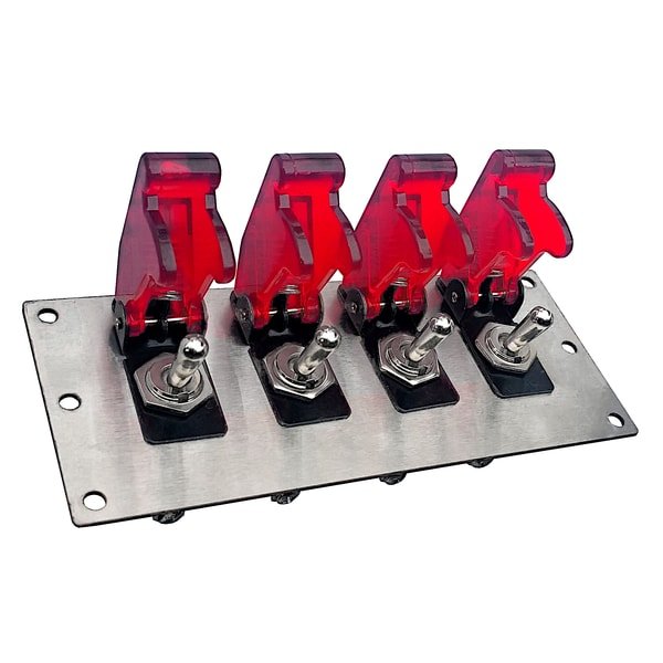
You know you are doing serious work if you are flipping one of these. This example is even red to make sure you know how serious it is.
Why don’t we have something similar on the web?
My first answer is – because we don’t launch missiles via the internet (I hope!).
My more involved answer is – we do. Nearly every form that you encounter has validation, either in line or on submit, that returns any error with (hopefully) a label in red letting you know where you went wrong.
But is that pattern the best experience? Especially with poor connections and fears of security? Wouldn’t it give users a higher sense of control if we offered them a ‘cover’ on the submit button?
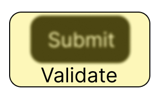
Here’s a skeuomorphic example, with a literal “cover” on the submit button, which is labeled “Validate.” On press, the form would be validated, and to make correction easy, I imagine the elements needing attention could be listed next to the button.
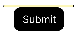
On completion of validation, the ‘cover’ would swing open and the user has the option to click Submit.
I know the wags out there will object because it is two presses instead of one, but it isn’t any more than the usual submit/correct/submit again.
Will this pattern replace the usual submit/validate/send results pattern? No. This is, to me, only usable and advisable in two instances.
- When an accidental submission would be disaster. If, god forbid, we wire up the nukes to the web, I hope the DoD will consider this and put an enormous obstacle in the way of validation.
- Games. It’s fun, it gives a sense of drama as in the movies.
