“Ready when you are, C.B.!”

For those who don’t recognize the line above, here’s a short explanation:

Cecil B. DeMille was a Hollywood producer/director. He did BIG movies, when movies were BIG. He spared no expense in his productions and, more to the point, did things in a BIG way.

According to legend, DeMille needed to film a gigantic scene with hundreds of extras, animals, stunt men, all during a flood. In the version of the story I’m familiar with, he was filming Noah’s flood. The normal procedure is to film many small scenes in which the cast are getting rained on, pelted with buckets of water, or you put them in a pool, etc. Little semiotic scenes that represent the whole picture of the whole world flooding.

That is not the C.B. DeMille way.

Cecil B. DeMille, on the other hand, dammed a small river in California, created a set, populated it with hundreds of extras and surrounded the scene with cameras. At the shout of, “Action!” the dam was blown, the flood hit the set and the actors ran for their lives. Legend has it, very little acting was done that day, and miraculously, nobody was hurt.

The punchline of the story is that of the cameras, all had malfunctions and C.B., fearing his one chance to film the cataclysm was gone, called desperately to his crane camera operator hoping the man had gotten the shot. The cameraman, thinking the damn bursting was a rehersal, reported, “Ready when you are, C.B.!”

Which is my typically long winded way of introducing a somewhat tongue-in-cheek idea that I’ve used over the years, “The Cecil B. DeMille School of Problem Solving.”

“What is the Cecil B. DeMille School of Problem Solving?” asks Mr. Exposition.

I’ll explain.

The Cecil B. DeMille School of Problem Solving comes in handy when you have run into a wall and and no idea seems to quite fit. At that point, why not consider the ridiculous, most outrageous idea possible? Why not dam a river? Why not endanger the lives of hundreds of actors? Why not go spectacular?

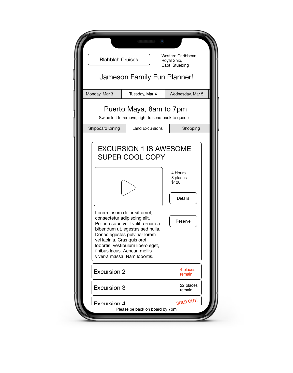
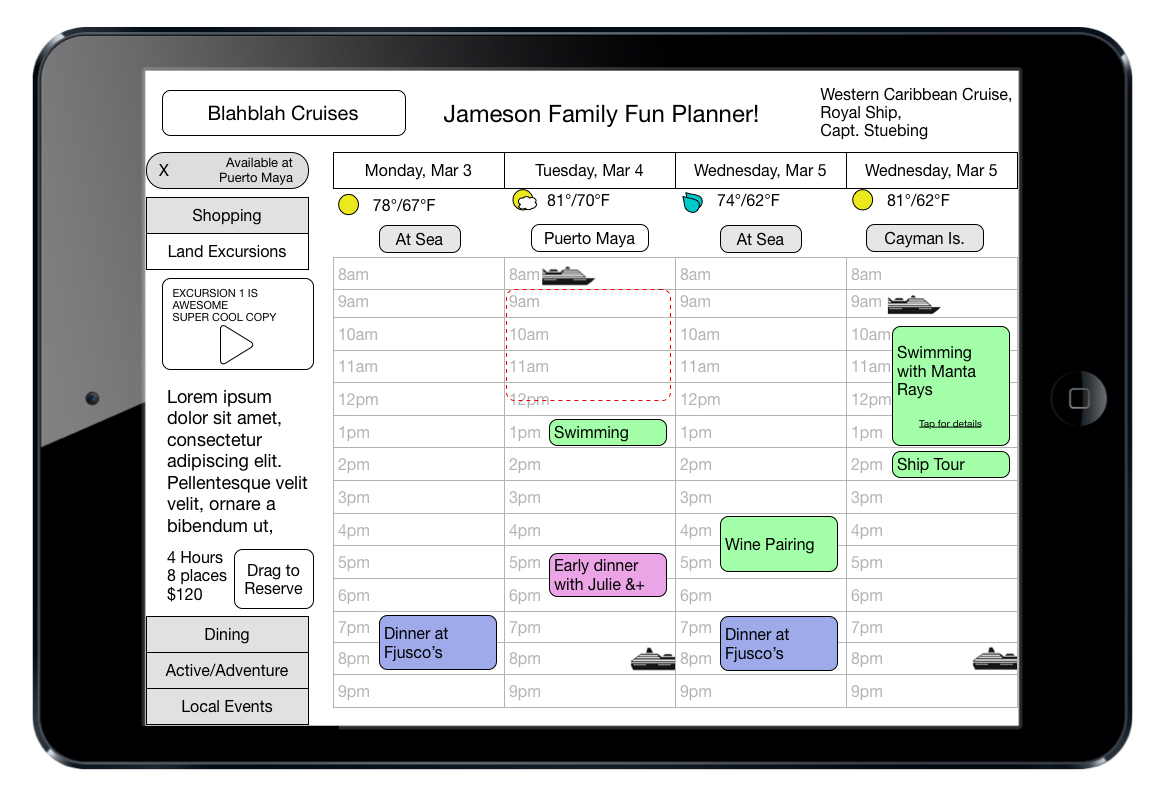
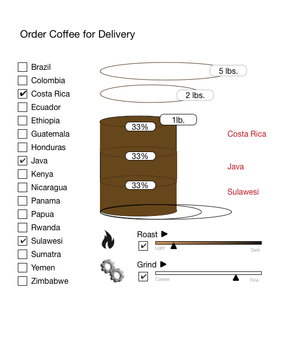
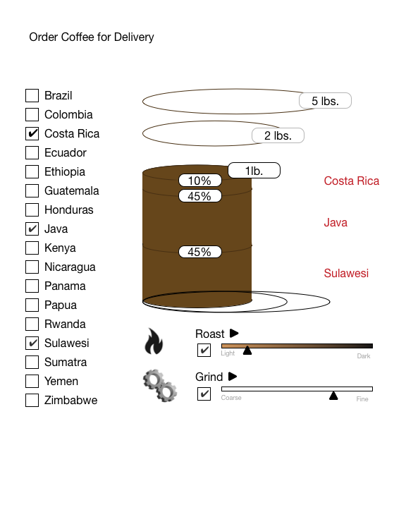
This has actually helped in my UX career. Can’t find a usability firm that is cheap enough? Why not build your own lab? Can’t fit all the content into one coherent model? Why not build two websites in one to fit the two radically different personas? Already building a coffee distribution app? Why not introduce every level of customization to satisfy the craziest coffee obsessive?

Usually the C.B. ideas get watered down or tossed entirely, but they can lead to more practical ideas once you start fixing the inherent problems of the crazy idea with practical suggestions.

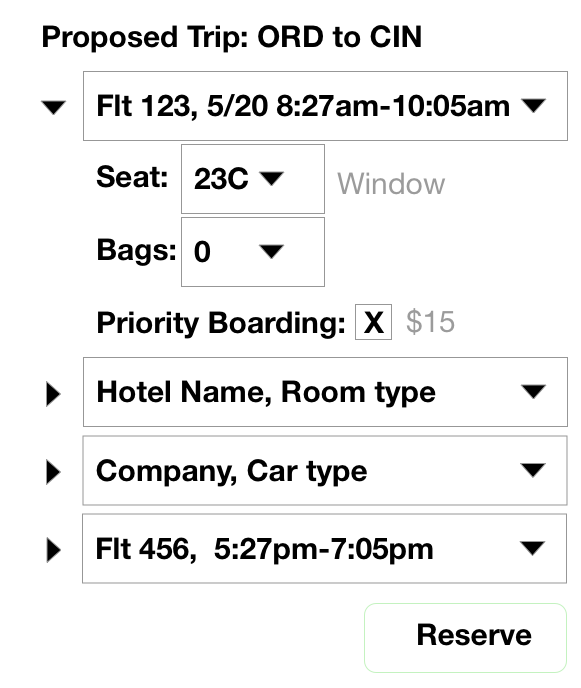
I’ll give you a good example. When I was designing the ATM for the Big NDA Bank, I suggested cutting all interfaces down to a single screen – all bank interactions, boiled down, are a really just moving one pile of cash to another pile of cash. Withdrawal = move some cash from savings to cash in my hand. Deposit = move pile of cash in my hand to savings pile.

This, of course, was too radical. ATMs are used by too many people to introduce that much novelty, but it did start me thinking about how do you show ‘move cash’ on a screen. Being rather skeuomorphic at the time, I thought, “see money, drag money,” the same way one operates in real life when playing poker or buying something at a convenience store – put your money down and push it toward the recipient.

This led to the tap the picture to download interface that is FINALLY starting to show up in ATMs eight years later.

Was the original idea practical? Yes, but not for banks, which tend to be more conservative. Some day I hope to come across a similar requirement where moving things around and reclassifying them is the core action.

Now that I think of it, dropshippers could probably use this…. Quick, find a river, build a dam! Get some actors!

Ordering Ordering

Instacart is an interesting (if overpriced, IMHO) grocery delivery app. I use it because I don’t have a car but still like to eat. If either of those conditions were changed, I’d probably stop getting groceries delivered. In general, it is well designed – I have some problems when an order is being delivered – switching between the map showing the deliverer’s location and the regular interface is a pain. Also, there’s a bit of confusion where I am when I have more than one cart, but other than that, things work well.

But it could be better. One of the areas where the Instacart interface fails is item replacement.

When you shop for yourself, it is an easy matter of finding a replacement item when what you want is not available. You have an idea of what properties are important and what is unimportant in the item; e.g. when you order ice cream, you care that it is Ben and Jerry’s brand more than you care it is Chocolate flavored. However, Instacart does not offer an opportunity to communicate those layers of importance.

Instacart offers a simple replacement option:

As far as I can tell, it is a simple search based on the title of the item you chose. The system reads “Taylor” and “Broccoli” and “Florets” and gives the most relevant answers in relevance order. That’s good as far as it goes, but what if that replacement item is out of stock? What if the replacement item isn’t in the list of possible replacements?

The fall backs, a search in the replacement interface and a chat feature are clunky. They offer single replacement or a long conversation where one party, the app user, is blind. At that point, the process seems to be for shoppers to take a photo of the area where the item was found and ask for direction.

The chat feature is an even more egregious solution. If I wanted to direct a shopper and tell them a complex string of instructions, I would have done that in the first place and Instacart could just be replaced by a long annotated voice recording of my grocery list.

As always in this blog, back to basics – what is the user trying to do.

I, as the user, am trying to buy (for example) 32 ounces of yogurt. I prefer Fage strained (Greek style) 0% milk fat. So I choose, in the app:

“Fage Strained Yogurt, 0% Milkfat, 32oz.”

Back to basics – what, as a shopper, would I do if it wasn’t in stock?

I have priorities in my head, priorities I have never written down, but I can use when I’m at the grocery store, to find a suitable replacement.

In order of importance to me, here is the same product label as above:

  • Yogurt
  • Strained
  • 32oz
  • Fage
  • 0% Milkfat

It would be fairly simple to present an interface where I, as the orderer, disassemble the product description and then reassemble in order of importance to convey this algorithm to the actual shopper, but that would be a disaster for two reasons – 1, the actual shopper would have to reassemble the words into a product title to find it, a process fraught with error, and 2, some products have ‘poetic’ names, and they have no meaning when it comes to priority. For example: Ben and Jerry’s Ice Cream has a flavor called “Lights! Caramel! Action!” You as a developer have to either make the entire flavor a single string in your ordering OR hope that the word “Caramel” isn’t important.

Back to basics – in real life, you show importance by pointing at it.

If you consider a tap as the gesture of pointing, then we can easily record ‘importance’ by adjusting the font weight of a word that is tapped on. (Unfortunately this blog only offers two levels of font-weight (bold, normal) so I’ll simulate the results using italics, and underlining.)

Fage strained yogurt, 0% Milkfat, 32oz.

This isn’t ideal presentation in this blog, but you can easily pick out the prioritization of products based on this simple change. The actual shopper will understand that 32oz of strained yogurt is of high importance while the percent milkfat and brand is lower priority. If I had font weight at my disposal, I could get finer prioritization.

Caution: Adult Subject Matter

My current work is with a resort company who will remain nameless. It’s a good job and I certainly enjoy it, especially because I get to work from home – I hate commuting with the burning intensity of a billion stars.

One of the best parts of my job is that I get to work with a research company that is exacting. Really exacting, as in A/B testing that gets not just the traffic numbers but the statistical significance of each finding. After years of testing, sometimes conducted by myself, I always had an answer, but had lingering doubts about the testing format and conclusions. I’ve asked these guys numerous questions about their methods, their data processing and every procedure I can think of. They have solid research results, and that’s a great relief.

Except when it proves me wrong. Then it’s annoying, but I don’t argue against their results, their results are reliable; I just adjust my working theory to the apparent truth and move on.

As an example: One known axiom of the travel/leisure business is that every resort has beaches, spas, restaurants, etc. so the first differentiators are cost, luxury level, and reviews. Next up may be a little less known, but is just as stark a split between customers – adult only resorts and family oriented. The families do NOT want to go to “Adult” places and adults (without kids) don’t want little ones running around ruining their romantic vacation.

There’s a problem with this split, though, in that you don’t want to explicitly ask the customer which resort orientation they want. The customer doesn’t really want to be “that person” who is intolerant to the other group, so adding a “Adult/Family” switch to a resort search is NOT recommended. That leads to a simple but surprisingly complex solution: a sub-grouping in the navigation and a family/adult label for each resort.

Easy – Add a subgrouping of “Adult Oriented,” and “Family Friendly” to the list of resorts. At that point. as you may experience, your brand and UX people get together and slam the brakes. “Adult Oriented?!” That has a bad connotation. We don’t want to suggest adults are running around naked and families will be trapped in their rooms to maintain innocence.

The first solution is to adjust the meaning of the term by using context. “Adult Oriented” isn’t “Adult Oriented *wink, wink*” if you put “Family Oriented” first in navigation. The context takes away the unfortunate connotation.

The theory is fairly well known in linguistics – the context of previous words influence the meaning of following words. For example, if I say “wing” without context, there are few connotations that come to mind, but specific words are not raised to your working memory. However, if I say “bluebird” and “wing” in a sentence, then “beak,” “eggs,” “flying,” and other words learned in context with “bluebird” are available. If, on the other hand, I say “politics” and “wing,” then words such as “conservative,” “socialist,” etc. are raised to your consciousness and the bird related words are relaxed.

Imagine a sentence that includes, “wing,” “politics,” “bluebird,” “eggs,” and “architecture,” and the mind reels.

This is where the research team mentioned above save the day by proving the cure is worse than the disease. They implemented the switch and put “Family Oriented” before “Adult Oriented” and sales dropped significantly.

The theory is that “Adult Oriented” customers are shopping lightly whereas “Family Oriented” customers are more adamant and specifically looking for resorts safe for kids; they will not compromise and they will not give up if their needs are not first. The Adult audience, though, gives up more easily.

That’s the theory, anyway. I’m still trying to fit the facts into my theory on this one.

Ultimately, the term was changed to “Adult Only” which isn’t strictly speaking true – you can book a room at an Adult resort (usually), its just that there will be no accommodation to family-friendliness by the staff or guests.

Tightly scheduled spontaneous fun

If you’re like me, and I know I am, you know that ‘spontaneous fun’ often requires a lot of planning. Sure, there are people who just randomly jump on a bus to Chicago and end up with a great weekend, but you only hear about those stories because they are the exception, not the rule. Trips must have a certain amount of planning. And planning means an interface of some sort.

Cruises, need planning even more so. You are having the time of your life – on a very tight schedule. If you are on a cruise, you are on NAVY time. The cruise ship will leave when the cruise ship will leave. No exceptions. Even if you ask really nicely, and know the captain, that ship has a schedule, and if the ship is in a busy port, hundreds of workers much less other ships are also on a schedule. That ship is leaving.

I mention this because I was once on a cruise and PANICKED when I realized I was half an hour away from the port, didn’t speak Spanish, and the ship was leaving in 30ish minutes. This leads to my first design for a cruise ship app – a PANIC button, in the form of the name of the cruise, the ship, and the captain, top right. Click it and emergency needs are there, ready to speak Spanish for you when you desperately need them. Maybe in the future it can also send an emergency beacon and drunk yahoos like me can have a car sent to bring me to port.

Hopefully, your mileage will vary and you’ll be better prepared than I.

Which brings me to my second interface – planning your fun. Cruises have a brazilian things to do. You want to ride a submarine? Done. You want to pet a sea turtle? Yeah, probably. You want to sit on a beach sipping margaritas? Yup.

But how do you browse all these things and reserve them so you don’t have to elbow your way past hundreds of other cruisers?

Here’s the interface:

Basic cruise planner

It is an iPhone app, usable when buying a cruise, prior to boarding, or even while on the ship.

The basic operation is, once you have a cruise in mind, you can browse activities much like one browses people in Tinder – slide left to dismiss, slide right to keep. If you want, you can filter by day available and/or activity type, or just browse.

Presumably, once you have an item in mind, you can just book it on the app (in another screen).

If we have a bit more room, say an iPad, we can actually get a complete planner going.

This would show the whole cruise (scrollable date columns could continue to the right, and down for additional times). Each date is represented by a column showing the weather, arrival times, departure times, port of call, and other pertinent details.

The user would be able to scroll items in full screen, then if they feel like reserving something, the gallery would minimize to the left, the calendar would open and the user could drag the affordance into the calendar to reserve.

Note because events may be restricted to time/place, there is a requirement that the appropriate time be highlighted (red dotted line), so the user can drag/drop to reserve into that target.

This interface would also let the user tap on a time, like a normal scheduler, and create custom events (e.g. “Early dinner with Julie &+”). This system could also be linked to any restaurant system to ease reservations on board.

Make it so, Universe.

Same old grind

This post will probably be as close as I come to describing a complete business model just to show an interface. If you read this blog regularly, a) you have waaaaay too much time on your hands, and b) you might recall this interface, in which I simplified coffee ordering. Why? Because ordering coffee at a coffee shop – over the sound of an espresso machine, a grinder, and the sound of half a dozen authors – each writing The Great American Novel, really they are, they’re not just wasting time – is kind of hellish. It really should be automated.

The problem with that idea is that Starbucks has a billion bucks and can stomp any competition they want. Competing head to head with a giant corporation is like rolling a boulder up a sand hill. Even if you make a bit of headway, the sand hill will win.

But what of coffee roasting and delivering? There isn’t a 500 lb. gorilla in that space, except perhaps Stumptown. There is a real opportunity if you have the scratch to build an almost entirely automated roast coffee business that offers custom coffee blends at your door.

Imagine a company that has all the known varieties of coffee in large containers, all attached to funnels that pour down into a conveyor (a plate, a container, whatever). Said varieties are mediated by a machine connected to the internet that dispenses the coffee variety in ounces to fulfill a custom order.

Those containers are then sent to ovens for roasting, grinders for grinding, again all controlled by a system attached to the internet to target custom orders. Eventually the machine would funnel the roasted and ground coffee into 1lb., 2lb., or 5lb. bags, slap an address label and send them out.

All of this is possible, but how does the customer order?

Basic coffee order interface

This is a sketch of a web/tablet version. A mobile version could be created where the mix is chosen and then the percent, roast, grind in a separate screen.

The operation here is, I hope, self-explanatory. The user selects the kind of coffee they want (generic kinds used here, but you can plug in whatever kinds you have). As they select a coffee, a cylinder shape on screen is “filled” with the corresponding percent of that kind of bean – if they choose one coffee, 100%. If they choose two coffees, 50% and 50%. Three: 33% each, etc. Those percentages can be adjusted by sliding the widgets that appear once you’ve chosen two or more coffees:

Three coffees, each at 33% to start
Three coffees, with percentages adjusted

The user can then select the roast they want and the grind. I used generic terms here, but if desired, they could use coffee jargon and say “City Roast” or “Italian Roast.”

Note that the Roast and Grind labels have little triangles to the right. That is intended to show an option to roast or grind each variety of coffee separately, so the user can have fine ground light roast Sulawesi, dark roast coarse Kenyan, and and medium roast medium grind Costa Rica in the same pound of coffee, but I did not spell that out because only the truly mad coffee addicts would be that specific.

Finally, there’s a control for order size – press or drag from 1 lb to 5 lbs. If this system is for a wholesaler, the upper limit could be changed to 100 kilos, or whatever the largest order is.

Please make this happen, Universe. I really want to order a pound of coffee with 80% Sulawesi (city roast, fine grind), 10% Kenyan AA (medium-dark roast, coarse grind), and 10% Sumatra Mandelung (city roast, coarse grind).
Yes, I’m a mad coffee addict.

Doing some good

One of the companies at which I flung my resume is a non-profit consolidator – they are hoping to be the location where people first go to donate money for various causes. It’s a super-cool opportunity, and part of the interview process is to do a quick UX exercise, which I’ll take care of tomorrow. 

As per usual, I’m overthinking things, but I think I have a unique solution to their long term UX needs.  As a supervisor once said, ‘Working with me is like playing a game of darts where I ‘miss’ the board entirely but my dart foils a bank robbery that nobody else noticed.’

First one is easy – how do you become the ‘go to’ place whenever people want to donate money? The same way Macy’s became the place to shop for Black Friday – by placing what people want – right now! – up front and center consistently. In this case, there is always some disaster or cause that is top of mind. People want to help, and currently they watch the news or social media to find out if there is an “Official” website. 

If this company, whom I will call help.org, made it a practice of jumping out front for trending events and posting a quick ‘donate now’ button and an explanation that they’ve already done the investigation and have designated or created the ‘official charity’, the site will, in short order, become the default website/app for quick donations.

After a few rounds, once the trust is built up, the website could potentially just put up a notice saying the best charity for disaster X hasn’t been chosen, but you can donate immediately and we’ll get your OK to give them the money once we’ve found the best charity.

Boom! Help.org becomes THE website/app to donate when you are moved by events.

The other issue, getting more people involved and keeping them involved, requires a bit more subtle solution. For inspiration, I turn to the most successful money gatherers ever – the stock market

A few years back, the Wall Street guys came up with a brilliant solution to the complexity of investment – mutual funds and, later, mutual funds with a targeted retirement date. Here is an example prospectus:

Instead of requiring the user to be sophisticated enough to pick individual stocks, the mutual fund let’s the user put money into a fund and the fund then invests in several individual securities. In the case of targeted date funds, they are automatically rebalanced each year, so you attach your banking info, tell them to withdraw when ready, and you just ignore it while it (hopefully) grows.

Imagine the same for donations.

Right now, you can pick individual charities to support, write a check for each, and repeat. Eventually, you’ll get tired of it, and start to “forget” the checks.

Now imagine an experience where you decide the cause, not the charity. For example, education in South America (I support the awesome Biblio Burro in Colombia). You go to the website, sign up, pick the ‘cause fund’ that most closely matches your desire, e.g. an Education South America Fund. You look at the prospectus which lists each (already researched) charities, and what percent goes to each. You can then adopt that fund, decide to donate one time or to make a continuing donation.  Assuming banking information is on file, the donation will flow to the individual charities that make up the fund.

Moving forward, in order to activate in the social media area, the site can implement user created funds – let the users create a fund of charities, determine which charity gets what percent of the donations, and, if possible, defines the measures for success. This will give the users an incentive to become fund evangelists, sharing their fund on social media, soliciting door to door, and maybe even holding fundraisers.  Since the ’cause fund’ would only be a table in a SQL database, there should be zero additional overhead, so all the usual amount goes to the charities.

I haven’t worked out the interface needed to create a cause fund, but I’m sure it would be fun, something along the lines of the Coffee Ordering idea, all drag and drop, as visual as possible. 

Lemme know what you think in the comments.

Road Warrior

Too often in HCI (Human Computer Interaction) design we emphasize the computer part over the human part. We forget that the goal is NOT to show the user every amazing option and function the computer has at its virtual fingertips, but to let the computer make some decisions and, by doing so, we can free the human. As an example of this, travel, especially business travel, should be a lot simpler.

Waaaay back in the day, around the turn in the millennium, I was a Road Warrior, a 100% travel consultant. I flew a Devil’s Triangle between Minneapolis, Chicago, and Kansas City. I flew so often between MSP and ORD that the Northwest Airline crews knew me by first name.

I learned early on that tourists and business travelers are different species. Where the tourist wants to see and experience everything so – at their best – little issues in travel are “an adventure” and will make a great story when they get home. The business traveler, on the other hand, is not there to “experience” anything. They are traveling to work, and anything that gets in the way is lost productivity, or worse, lost money.

Your average business traveler knows what they want because they’ve experienced it all and can easily list the airlines they prefer and, even more easily, list the airlines they will never fly. For example, I learned to loathe United Airlines, partially because of their “service” but mostly because they changed the rules on me and stole 60,000+ frequent flyer miles from me. I suffered for those miles so to the end of my days, United is always second to the bottom of preferred airlines (Aeroflot is always at the bottom of my list, but that’s another story).

This leads to a very simple interface that, if combined with other simple interfaces, produces a remarkable experience, or more accurately, a simple non-experience, just a service. If we want to gather the airlines preferences for business travelers, we can ask them to just rank them, favorite to least favorite, but that gives us only a vague idea of how they would differentiate them. If, on the other hand, we asked them to handicap airlines in a $ value, we get specific information that can be acted upon. I, for example, prefer Delta Airlines over American Airlines. If the fare is similar, though, I’ll fly either one. How much would I pay to fly Delta over American? Maybe $50?

On the other hand, if Aeroflot is an option, I’ll choose “When hell freezes over!”

This information can then actually allow the system to make decisions for the traveler. There is no point in showing me any United or Aeroflot flight options, and if American is more expensive for the flight I want, then just show me the Delta flights.

Each possible preference can be gathered and handicapped:

  • Home Airport(s)
  • Preferred flight time outgoing
  • Preferred flight time returning
  • Preferred seating class
  • Preferred meal or in cabin service
  • Preferred Hotel Chain
  • Preferred Hotel distance (to workplace or airport)
  • Preferred Car Rental company
  • Preferred Car type

Imagine each of the above as a set of dollar value preferences, each little decision you have to make to book a business trip, codified and measured.

If we get one final input of ‘total cost target’ for the trip, which can be set by either the user or by their employer, the system has all the information to get the most agreeable possible trip for the business traveler.

This allows a very simple result interface wherein the business traveler just inputs the destination, the dates of travel and everything else will be decided by the system. Literally three inputs and the system at the time of use and we get something like this:

The entire trip is based on preferences. Each element is a proposed solution which best matches the user’s preferences. Each can be overridden by clicking on the dropdown and choosing the second, third, fourth best options. Under each option, specifics can be edited, such as seat number or room type or car type.

Imagine that interface, as an experienced user. You open the app on your phone, choose a trip to Cincinatti, choose your dates, and then ‘Find’. In a couple seconds the optimum business trip is proposed and you hit ‘Reserve’ and get on with your day. Easy.

Adventures in automated design

My personal website design depends on a number of factors, but the practical upshot of it is that it almost never has the same design twice, but it automatically harmonizes and still conveys useful information.

I’m not just a UX/Visual Designer, I’m also a fairly accomplished full stack developer. I don’t recall the version of PHP I started with, but my guess would be 3.0 back in about 1997. My personal website, http://cnordling.com/ is the recipient of a lot of my experiments.

For those lucky enough to see it a few years ago, it included an analog clock and a mini-google map. These items were updated whenever I moved around or traveled. Sadly COVID-19 has clipped my wings, so now the location is more aspirational.

Being homebound, however, does not mean leaving the website to rest, it means adding some other peculiar functionality, in this case – automated color schemes.

Color Schemes


Thanks to Tiger Color for these images.

Everyone knows the color wheel, right? All the colors arranged in a circle, usually with higher value colors inside, lower values outside. Those are handy for showing color schemes.

This is your basic complementary color scheme.

In code, colors are represented by a number of different numbering methods. Most used is RGB – Red, Green, Blue, which assigns a number 0-255 for the amount of Red, Green, and Blue mixed as additive colors. Very simple to understand, a big pain in the butt to adjust programmatically.

Automating Color Schemes


A better system for my purposes is the HSL or HSV system. H = Hue (angle on the color wheel), S = Saturation (how much color), and L = Level (how much white is mixed in). In the case of HSV, the V = Value, another word for Level.

The HSL system is easier because of that first gorgeous number, the H, or Hue Angle. If you have an HSL color with H= 0, that color will be some version of red. This is the cool part – if you wanna get a simple complementary color, you just add 180 to that. If it goes over 360°, then just subtract 360 to get back in the color wheel range.

function complement($degree){
    $degree = $complement+180;
        if($complement >= 360){
            $complement = $complement-360;
        }
   return $complement;
}

Easy.

But what about Split Complementary colors?

Split Complementary Color Scheme, with a primary color at 180°, and secondary colors at 330° and 30°

Easy enough, just create an array and return two colors:

function getSplits($degree){
    $splits = array();
    $splits[0] = $degree+150;
    $splits[1] = $degree+210;
    for($i=0; $i<2; $i++){
        if($splits[$i] > 360){
            $splits[$i] = $splits[$i]-360;
        }
        
    }
    return $splits;
}

So far so good – this will return you two Hue angles at split complementary degrees, and will give you a basic, though a bit clashy color scheme.

The problem is that if you’re going to use these colors for text in context with each other, you’ll get a serious case of Eye Jaggies* – that weird optical thing when your brain sees the color border as kind of flashing/moving.

Uncomfortable jaggies are fine for Pop Art, not cool when reading, so it is important to either turn the value UP against a dark color or turn it DOWN against a light color.

So, a quick adjustment to the function:

function getSplits($degree, $value){
    $splits = array();
    $splits[0] = array();
    $splits[1] = array();
    $splits[0][0]= $degree+150;
    $splits[1][0] = $degree+210;
    for($i=0; $i<2; $i++){
        if($splits[$i][0] > 360){
            $splits[$i][0] = $splits[$i]-360;
        }
        if($value > 50){
            //if the value is over 50, make the split dark
            $splits[$i][1] = "20%";
        }else{
            //if the value is 50 or below, make the split       
            // bright
            $splits[$i][1] = "80%";
        }
    }
    

    return $splits;
}

Here is the end result, a website that has the navigation color correspond to the temperature of the place pictured, and a text color scheme that is a split complement to that color:

http://cnordling.com/

Next step: Adding an array of cities/countries I want to visit, choosing one randomly, grabbing a random photo and then harmonizing the colors to that photo.

*Eye Jaggies is my term for a really interesting phenomenon caused by the fact that color vision is an evolutionary layer OVER grayscale vision. Your brain, miracle that it is, gets the data from your eyes and sends it to a number of processing centers to create a complete version of what it is seeing. One of those processors sees in grayscale (black and white) and is the primary source for the brain to interpret edges. If it is two different values (level of white) it is probably an edge between two things. If there is no significant difference in value, this part of your brain says it is continuous.

However, the brain later developed color vision, which also minimal edge detection, but that detection is based on HUE – the degree on the color wheel. If your color vision sees orange and blue next to each other, it declares there is an edge, therefore two different things.

Put those two together and your mind is told ‘edge’ / ‘no edge’ by two different sub-processors, and whatever part of the brain that decides which is right just throws its hands up – the end result of that is your mind sees edge/no-edge as your eyes move slightly.

Hi-yo, Silver!

This isn’t a complete interface, just a sketch of an idea. I did a job interview with a financing company and had an idea while talking UI with them.

It occurred to me that one of the hurdles to making a loan is the unknowns, how much you have to pay, when the loan will be paid off, et cetera. Most interfaces I’ve seen on credit card sites are fairly basic, saying what the interest rate is, how much your credit limit is, and so forth. There doesn’t seem to be a tool to really picture a loan, one place to juggle the variables to get something acceptable.

This is what I came up with. The idea is that the two sliders along a line are easily adjustable and as you adjust them, the pay off date will change based on the loan math. For example, if you slide the payment widget to the right – plan to pay more per payment – then the loan payoff date is adjusted downwards. Or conversely, if you – or more likely, your creditor – adjusts the interest rate, the payoff date would advance.

loan_arranger


I debated which items to put into the slider. Originally I thought I’d include the principal and the payment, but I reasoned that a loan principal is usually the prime consideration in a loan decision. The interest rate is more likely negotiable than the principal needed.

I also considered making the payoff date a slider, but I really can’t picture a use case where someone has a payoff date in mind and wants to know how much at what interest rate they can get. The payoff date is more of a result than a deciding criterion.

Finally, although every loan I’ve been involved with has monthly payment cycles, to make the loan arranger complete, it needs an option to choose payments on a weekly, monthly, or annual basis. That variable is not something that lends itself to a number line, so that is left as a dropdown in the label.

I want to make sure that the reader understands that the “label” is dynamic, the text of which is changing with the use of the tools. This gets around the problem of people who might not understand the tool well, but still needs the solution spelled out in English.

Also, there is one note on order of operations here. I consider the interest rate and payment as semi-fixed, i.e. they will not move unless the user moves them. The principal amount, if changed, will only affect the payoff date, it will not change the sliders. For the unusual use case where someone wants to figure out how much they can afford and payoff by a specific date, they can put in a principal amount and then adjust the payment amount to hit the date they have in mind.

Finally, you may wonder why the payment slider ends at $1000. That’s 50% of the current principal. If you can’t figure out $2000 will be paid off in two $1000 payments, then you have more problems than this tool can solve.

E-commerce becomes ME-commerce

Waaaaaay back when I lived in DC, I was interviewing with various companies trying to move to New York. One of the companies that made me an offer had an interesting business model – they would send photographers to fashion shows who would take pictures of all the new looks from every angle. They would then knock them off, adjust the clothing designs enough to not get sued, and send the patterns to China to be mass produced.

I kinda wish I took that job. The one I did take turned out to be less than they described AND the knock off company job included two trips to Hong Kong every year.

Knocking off designs is not illegal, by the way, just not the most noble of business models. But their ethics are the least interesting thing. The most interesting thing is that they had digitized the pattern making process and sent the patterns overnight to China. No cloth moved from New York to China, just data. That meant by the time the fashion models were done partying in the wee hours, the clothes they wore were already being copied in sweatshops on the other side of the world.

Pattern Making

Add Clue #2: I recently saw a demo of software that allows one to enter clothing patterns into a simulation.   https://www.youtube.com/watch?v=NRi1F2wKPx0

The avatar in the demo is, I think, adjustable via various parameters (height, weight, various measurements, skin color, etc).

Digital Avatars put on Digital Clothes


Which leads to a question – why are we still sending digital patterns to China to make 100,000 versions of clothing when we could make them as needed? Why, for that matter, do we not “fix” the retail process and personalize it while we are at it?

Adjusting the Process

None of the technology is new or unproven. We have digital clothing patterns, we have fashion show software, we have physics engines that let us change cloth parameters (stretchiness, weight, strength, finish, etc.).

All we need to do is let the consumer create their own “model” in 3D, let that model show off clothing.  Some people have posted so many selfies, it is probably possible to build that model without any further user input.


Personal Avatar


Once an e-commence app has a user model and digital patterns for clothing, the next step is obvious – lose the models, lose the photographers, lose that HUGE expense, and let the user see herself in the clothes – clothes that don’t exist yet.

Pattern Making 2

Finally, we arrive at the ultimate in e-commerce personalization (and perhaps narcissism) – an e-catalog made entirely of the shopper showing herself in clothes she likes.

Pattern Making 3


If we then add as needed manufacturing – or some variation in which the shopper agrees to a discount if she is willing to wait until X hundred of the outfit are ordered, we have a value for the world – no extra production of clothing that will go unsold, no wasted effort, no wasted energy.

Each dress could, in fact, be a collection of decisions and open parameters. The designer would publish a design with certain fabric recommendations, color options, while reserving certain cuts, stitches, measurements as defining characteristics.  That way each dress would be “unique” but still recognizable as that designer.