“How much Dong is enough?”

ATMs generally suck. How do I know this? Most ATM vestibules are still attached to a bank with people in it. If ATMs were up to speed, the people backing them up wouldn’t be necessary.

One of the strangest conventions in the ATM is in the ‘unusual amount’ interface. If you want to withdraw $120, you get the dreaded keypad.

I’m sure you have encountered this and asked yourself, “Why do I have to type in the ones column? I can’t get $123 dollars, why am I able to type $123?”

The answer is that the bank has erred on the side of the least objectionable error. If they put the 0 in there and then expect you to type in “12” to get “$120,” too often people will type in “120” and discover too late they are withdrawing $1200.

That’s a bigger problem than a user typing in “12” and popping an error that says, “The ATM only has $20s.”

There is a better way.

Each ATM is made of a PC, a touchscreen, some hardware and four drawers of cash. A more ideal interface would show the user what is available in an image they recognize and allow them to pull the cash they need.

genericATM1

Basic ‘point and grunt’ ATM interface.

This interface is remarkably simple and virtually error free. The user taps on the bill they want, the bill drops from the stack into the ‘drawer’ space, simultaneously the running total is put into the Withdraw button (plus the ubiquitous fee).

genericATM2

The blue dots represent tapping to add bills to the withdrawal.

In this illustration the user has tapped the $20 stack three times and the $10 stack once, adding up to $70.

Note there are + and – buttons as a backup to those who are used to buttons (probably removable in 10 years or so as people become used to manipulating symbols directly on touch screens).

If the ATM screen can handle dragging, we can add a gesture that allows the user to withdraw five bills.

genericATM3

The blue drag symbol represents the user dragging 5 bills into their withdrawal stack.

Why five for the drag and not ten? This brings up an interesting rule of thumb for ATMs and money in general. Wherever you are in the world, no matter what the currency, the most common bill you’ll see in an ATM is a “significant” amount, but not a lot – enough to buy lunch but not enough to buy a car. Since ATMs have an interest in supplying the currency in useful amounts, walking around money is, for the most part, five to ten bills, no matter what those bills are.

Certainly, there are countries in which inflation is rampant and a shoebox full of cash is required to buy a sandwich, but those are the exceptions. Eventually, after the currency stabilizes, a ‘workhorse’ bill emerges which is used more often than others (currently the $20 bill in the US) and ATMs generally supply that bill and perhaps one smaller or larger.

This interface, if it was used universally, removes the need to do the math whenever you land in a new country and are required to figure out how much about $100 in the local currency and then figure out what the nearest equivalent is in actual bills.

For example, $100 equals 2,109,500₫ (Dong, the Vietnamese currency). Knowing that, you now have to figure out how many Dong that is in increments of 200,000 and 500,000 (the bills available). You can, in the standard keypad interface, enter 2,200,000 if you are familiar with the bills. If it doesn’t have the 200,000₫ bill, you’ll get the familiar warning to enter amounts (of 500,000).

With the click and drag pictures of the bills, no matter where you are in the world, you can withdraw five of the bills, whether they are Euros or Dong or Rubles. No math necessary, no guessing what is in the ATM.

dong

A variation on the interface which allows two currencies in the same ATM.

Even if you don’t understand the language, you can figure out what the larger currency is and because of the rule of thumb regarding the number of bills, you can withdraw five of the larger bills and be fairly confident that this is the correct amount of walking around money.

Finally, as you may have noticed in the last illustration above, the ATM can dispense more than one currency in a withdrawal. Rather than ask the user what currency they want, perform a withdrawal and then repeat, the ATM can just present what is available and the user can choose what they want in specific amounts in each currency.

Couch Potato-ing à la Carte

This idea is so dead simple, I can’t claim it’s my own because once you see it, you’ll say, “Well, duh.”

However, since I haven’t seen this anywhere online yet, I’ll just assume it is new.

The problem: TV News, Print News, Every kind of news, travel shows, cooking shows, are all failing miserably in the ‘gimme what I want’ era.

The solution is, as usual, to blow everything up and atomize it, then give the user the tools to put it together in their own way.

Imagine if video production teams made small videos for each subject, sort of the equivalent of filing a story for the newspaper. Each video would be tagged, categorized, and most importantly, priced. That price can be either a micropayment or ad time. It might be difficult to price at first and figure out what the shooting budget can be, so there is some risk in the transition.

Now the important part, the consumption. How do the users watch all these multiple videos without “channels”?

Fire the programming managers and take their place! (I’ve certainly wanted to do that to whomever is programming the “History Channel” which is now more accurately termed the aliens and conspiracy theory channel.)

With 10 minutes, you can plan an evening of couch potato-ing rather than channel surfing.

Image

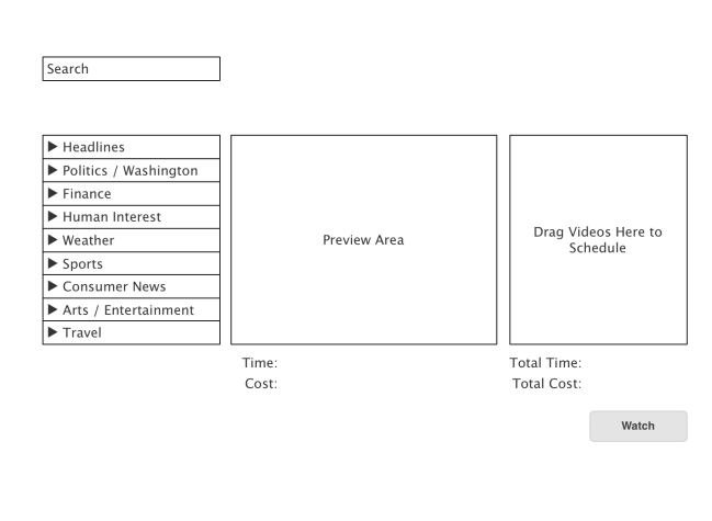
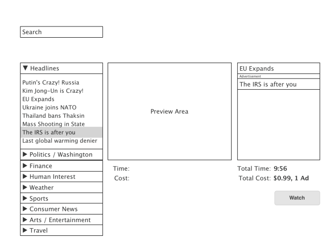
Starting interface. Videos on offer are on the left, work progresses from left to right.

Image

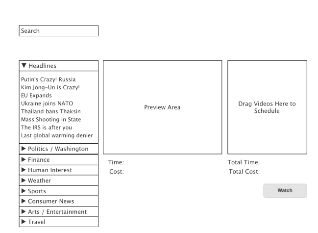
The user chooses headline news, which expands downwards to show the videos on offer.

Image

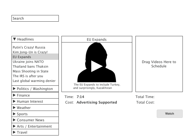
The user clicks on a video, and it fills the preview area. User can read a description or watch the preview.

Image

If the user wants it, he/she drags the video via title bar into the programming box on the right.

Note the first video is charged in advertising time (30 seconds) which is added onto the video program when the user adds it to his/her queue on the right.

Image

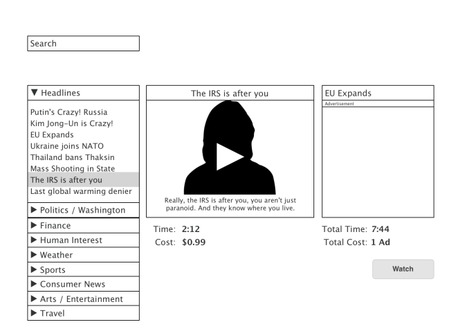
User chooses another video to preview.

Unlike the first video, this one has a direct cost (99 cents), so if/when the user chooses the  Watch button, his or her stored credit card is charged when they click the Watch button.

Image

User has chosen the second video by dragging it to the right. The total time and cost are summed below the programming box.

This sketch has primarily news content in mind, but it could easily be used for movies, news, special interest shows, whatever. I imagine it could even include radio.

Mobile Shopping the 3D Way

Please take a moment to read the prior posting at https://uxunbound.wordpress.com/2014/04/08/how-about-another-dimension/
I’m going to be building on that concept of the three dimensional product plot to redesign mobile shopping, so I want to make sure every reader knows what I mean by a three dimensional product plot.

Wine shopping is an interesting phenomenon. There are thousands of wines out there, hundreds in every possible category, and nobody but a select few know how to pick these wines. However, people know what they like and with the proper interface, they can discover wines (or any other item that has such a wide array of items such as movies, music, books etc.) that they can be relatively certain they will like because they start out with something they know (or was suggested by a more knowledgeable friend).

If you can picture the idea of a multi-dimensional plot of wines, you can imagine a very easy way to traverse that set of items by entering that array, visually, and present tools to move the view along any axis the user might desire. As it happens, a mobile device is a perfect tool to traverse that array.

Image

Mobile wine shopping mobile interface.

In this case we are shopping for wine and we have landed on a single vintage from Spain called “Bodega Lan Crianza Rioja.”  This would be perhaps the top item by relevance from a search in another interface. Perhaps this is an app that the user has entered the wines they have liked and allows them to look for something similar.

In the mobile interface we have the swipe, which is a very easy way to traverse the array of wines in our search results.
If we assume the user likes the Rioja but wants something with a similar taste profile but costs less, he/she just has to swipe from the ‘less expensive’ area toward the center.

Image

Swipe to find less expensive wines.

The user accomplishes this by swiping the requested aspect into the center. The Rioja that was in the center would move to the upper right (More Expensive) slot. More importantly all of the items would change so that if the user moves in another dimension, the price would be (approximately) maintained. If they’ve reached a price point they like, they can then pivot and choose a wine that is sweeter – dryer or more body – less body.

Other dimensions are possible, most likely via a separate preferences pane.

The filtering mechanism is simplified to a country picker (or region for expert users).

Image

Pick a country.

A simple tab lets the user switch from reds to white. There may need to be a tab for bubbly wines since that seems to be a separate category.

There’s also a share button on the interface. We do social everything these days, so I am imagining a social aspect to this as your wine friends find wines you might like or vice versa, they can send you a wine suggestion.

As you traverse the wine array, you can also share wine with your friend.

Image

Share a wine with a friend.

I imagine this ping pong action could go on for a while.

Image

Your wine expert friend suggests a wine for you.

If you accept this suggestion, it becomes the center wine and wines that are similar are arrayed around it based on your chosen spectra (sweet – dry, more money – less money, etc.).