The Royal Road

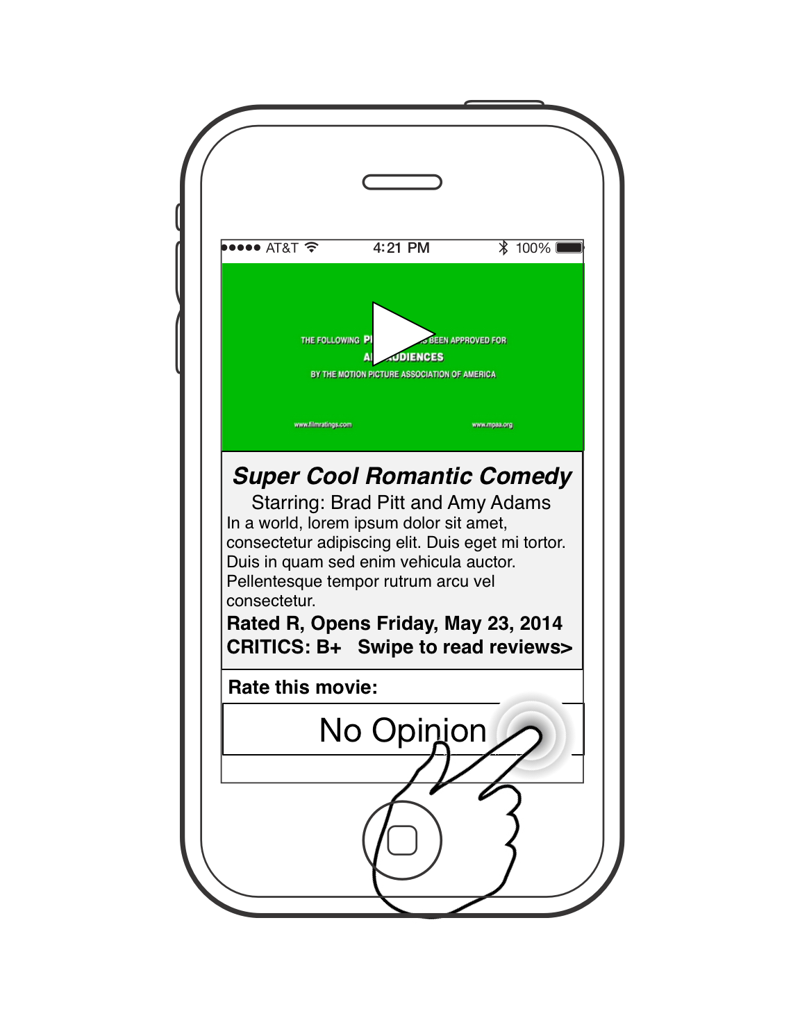
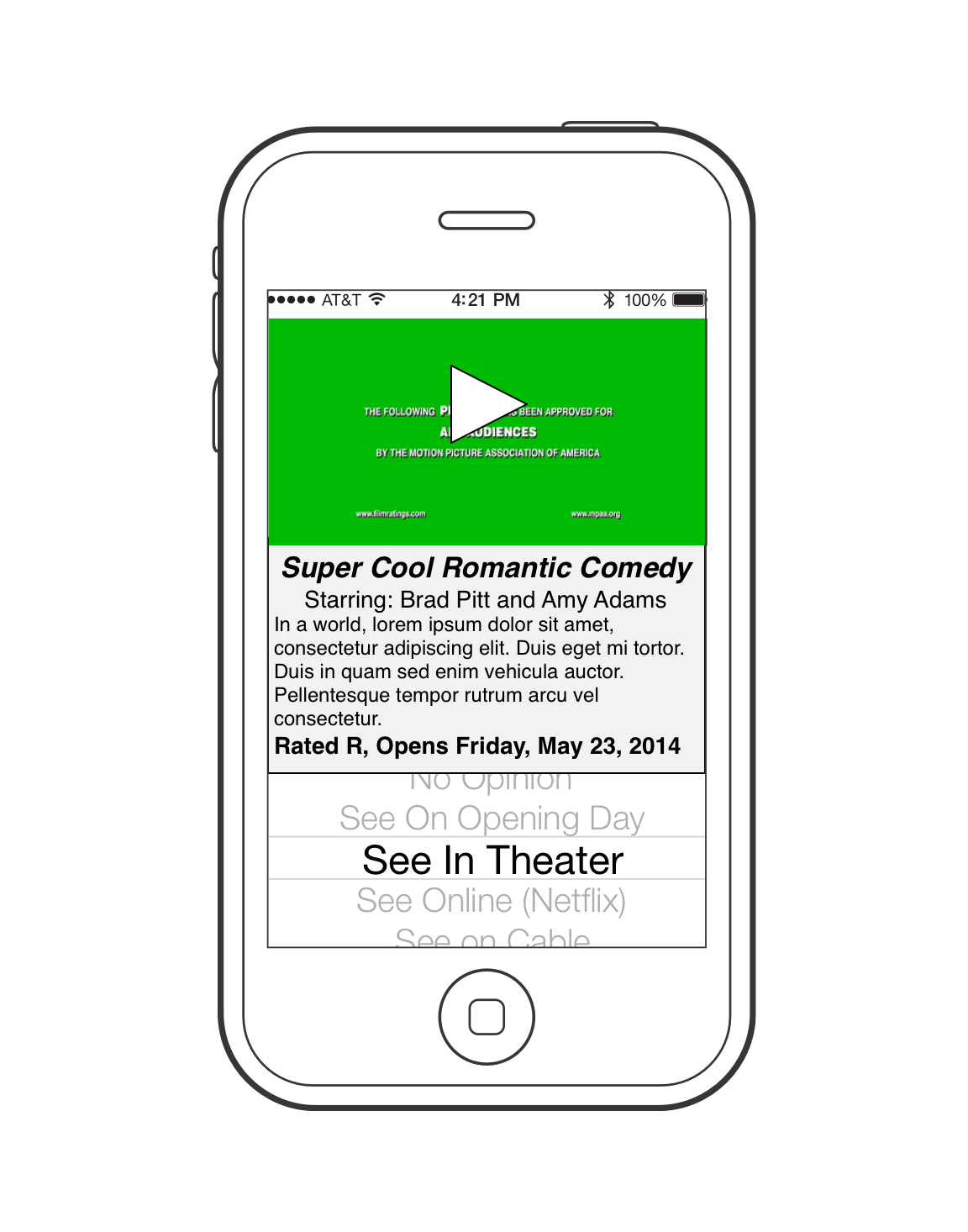
I’m working on an heuristic analysis of the mobile site for Royal Caribbean and thought I’d drop my notes here rather than on some random file on my laptop.

I can hear my regular readers say, “cruises again?” Well, yes. But this time instead of revolutionary ideas or imagined apps, I am looking at an actual cruise company mobile site with an eye toward getting people into the sale funnel. Cruises are an interesting case because it is a relatively large expense – larger than users are comfortable making via a cell phone.

Keep in mind this is just first impressions and thoughts, not a strict evaluation. I’ll link the evaluation here when its done OR you can just poke around my assets folder and look for something starting with Royal Caribbean.

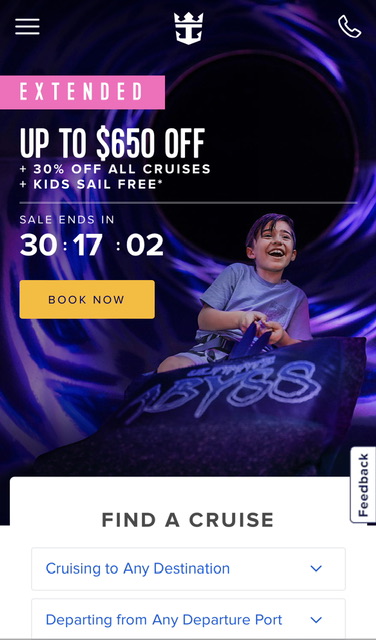
My first impression is that the sale space takes up an inordinate amount of space on the home page. I assume this is not normal. My other first thought is that this appears to be a straight up website, not a geo-fenced app – a lot of companies in the hospitality biz are creating websites which are location aware and if you go to the website when you are at the resort or on the ship, the website changes function completely and becomes an app for customers to manage their vacation. Since this app didn’t ask for location privileges, I assume it does not do this.

The visual design seems tight. All the colors are in tune, the fonts look under control.

The phone icon at the top right suggests to me that – what I was told 15 years ago – customers are still hesitant to order cruises online and prefer a phone call/agent. I’m sure this is shifting as the internet generations are getting into their cruising days, but it suggests a bit handholding and explanation would go a long way toward purchase.

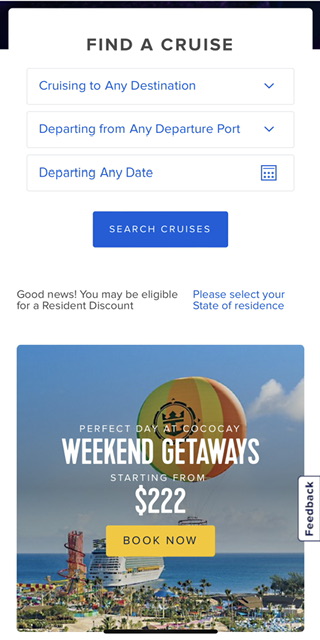
The ‘find a cruise’ is, unfortunately, about average for cruises. The assumption is that people will buy cruises based on destination. This is sensible, and I’m sure it is borne out by data, but this is where – MY OPINION – purely evaluating what exists fails to bring in the whole audience.

Where is the affordance for people who want to travel to go scuba diving? What about theme cruises? What about wedding cruises? I’m sure most are still shopping by location and date, but that doesn’t mean there aren’t people with other primary criteria in mind.

I was recently shopping for cruises with the criteria of “not too expensive, in port somewhere on New Year’s Eve,” and found it nearly impossible. The best I could do was select cruises by departure date and go through all the results. A disappointing experience, so I will not be taking a cruise this New Year.

Dates

A quick note about dates: Most cruises and travel sites in general seem to think that we have endless vacation time. When we choose to search by date, it is usually by departure date and then a supplementary affordance for length of cruise, and we are left doing math in our heads, trying to figure out if that fits our vacation window.

A better way to do this is to give a window start and end date and let me see cruises that fit within that time. Maybe a checkbox that says ‘allow for one day at beginning and end for air travel.’

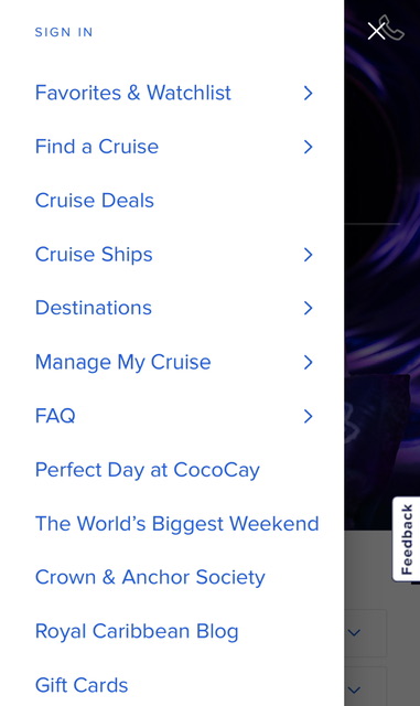
I see “Manage My Cruise” so maybe that’s where onboard functions are hidden.

I Royal Caribbean Blog really a top level item?

I like that Cruise Ships are a top level item. I’m not a cruise ship geek, but I know from my work with Hyatt that some people are hesitant to buy a cruise/resort stay and all aspects that they can ‘experience’ prior to purchase is a good thing. However, what I’d like to see is “What is it like cruising?” with subjects like “getting on board,” “how to find your cabin,” “No Seasickness,” “LIfe on Board,” “Never a dull moment,” and other items. If I could “experience” a trip in a video/multimedia section, I am much more likely to feel comfortable with purchase. (Again, these are impression notes, not an actual evaluation)

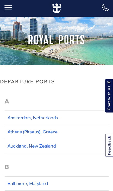
I like that they have each departure port listed, but it is a daunting list. This is also a failed opportunity in that each port should include a list of cruises that start or dock there.

I find this is a failing of sites in general, they all have endpoints and never think of them as entry points that users may drop into while trying to find tangential or ‘up one level’ info. If I did a search on Google for ‘Amsterdam cruise port,’ and thought I’d like to cruise from there, if I landed on this page, I would have to go to the top of the page and do a new search. A simple block showing which ship will be in this port and a note saying ‘visiting,’ ‘departing,’ or ‘debarking’ could lead to a sale.

I like that “Family Cruises” is an option. I learned at Hyatt that family travelers are a big segment of the public, and if they get a hint of “non-family” content, they give it a wide berth. (“Wide berth” is an odd phrase, now that I’m in a nautical frame of mind.”)

But given the link that separates an audience, this list doesn’t really make sense. If it is a list of separable audiences, where are the others? Where are ‘Romantic Cruises’ or ‘Theme Cruises’ or ‘Adventure Cruises.’? I’d like to see more effort toward segmentation in order to give the respective audiences more concentrated and nuanced online content in order to induce sales.

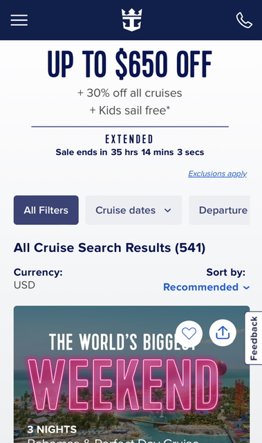
THIS is where I see problems. I’ve already performed a simple search, and am anticipating results, but too much of the screen is taken up by ads. I have not searched on ‘kids cruises’ nor ‘weekend cruises’ so why am I being tugged toward those types of cruises? Show me my results! The results are of course below, but why make me scroll through ads in which Royal Caribbean should KNOW by now I’m not interested? If it must include an ad, make it one that conforms to my search.

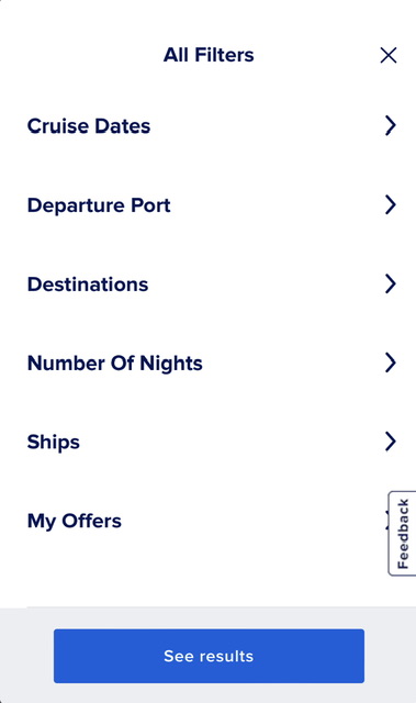
I like the distance between options – lots of fat finger space. I’ve already mentioned the ‘Number of Nights’ x Dates failure. I am surprised ‘Ships’ is so prominent. Are there that many dedicated cruisers that picking by ship rather than other criteria is of primary concern?

The Royal Road

If you’re wondering about the headline, I’ll explain. The “Royal Road” is just a common phrase in UX to designate the primary path through an experience. If you shop at amazon, the Royal Road is search, primary product page(s), add to cart, checkout. That is an ideal experience, and a more typical experience is much more convoluted. The job of the designer is to give signposts and, in some cases, strong arm the user onto the Royal Road to effect a sale. If a user gets off the primary path toward sales, we put up all manner of enticements and redirects to get the user back to where they should be. It is a subtle art as redirects might seem to draw off the primary path, but as I often must remind product managers, yes, we want to get the user to the checkout, but just as importantly, we want to get them to the checkout with confidence that they have found the best item for them at the best price.

Preferential Treatment

One of the things that many companies collect and RARELY use properly are preferences. Preferences, if collected and converted to usable data, virtually eliminate the need for an interface for a lot of interactions.

As an example, I live in New York City, and have three airports to choose from when I travel. JFK is the one most know, because it’s the biggest. However, it takes $60ish to get there by cab and cab is virtually the only decent way to get there. You can get there by train for $7.50, but it takes 2.5 hours and at least one train change. I can get to Newark airport in about 30 minutes for $17.50 and a minimum of hassle. LaGuardia, on the other hand, is a $30 cab away (forget about getting there by train. It’s a ridiculous bus ride away).

As a result, Newark has about a $50 handicap for me (I’ll pay $50 more to go to Newark than JFK).

When I lived in DC, it was even more obvious. BWI is right on the train, but it’s way out of the city. National Airport on the other hand was just a couple metro stops away (sweet!). Dulles wasn’t even a possibility. I’d pay $150 to fly out of National over Dulles.

I don’t have any actual data, but I imagine this is similar for most people (although most probably don’t reduce it to numbers or a map, they just have a simple preference)

If you mapped that preference, you can probably get an idea of which airport is preferred.

Airport Preference Map

Of course an actual map would be much blurrier and have more mixed areas, but this is just an illustration of an idea. The shaded area represents the preference of the people who find it easier to get to National than the other two airports.

This information isn’t too useful to me, of course, since I am just a point of data on the map. It would be useful to an airline, of course, who could price flights accordingly if they know my address (nobody tell the airline this, please. I’m moving toward another idea, I just need this as an interim step).

This is just ONE data point in a long list of potential travel preferences. Imagine what we could do with multiple data points, each placed on a map with a ‘gravity’ given to each one.

For example, imagine if you were given a series of quick descriptions of potential roadside attractions (fun fairs, restaurants, music venues, malls, whatever your interest might be).

Gathering Preferences

Gathering Preferences

The details of the gathering preferences is important, but the critical part is to get a NUMBER or some other comparable data point for each possible attraction.

These numbers (and the geo location of these attractions) can then be converted into something that can would normally be referred to as a heat map, but I think color doesn’t quite do it justice. I’d rather these items be converted into a Gravity Map.

When I say something is a “Must see!” I am, in effect, saying that I am willing to do X in order to see that attraction. If I rate it as a “Meh,” I’m saying I’m willing to do X/8 to see that attraction. All we have to do is convert that X into miles/hassle/traffic/cost, and we suddenly have a set of data that can create a remarkable result: A smart road trip planner:

Gravity Map

Gravity Map Road Trip Planner

With a set of preferences (attractions that I’ve scored based on how much hassle I’ll go through to see them), a destination (in this case Boston) and an hour value for free time for distractions, a simple algorithm can map out a great road trip.  It would be a good idea to ask how “tight” a schedule is wanted, which will determine how crazy to make the schedule.  In addition, I would borrow Google map’s ability to pick up and move paths, allowing me to overrule the planner to make sure to see the largest ball of twine or the world’s biggest pair of roller skates.

That is a road trip planner that asks only two questions, destination and free time.

Interestingly, I think this interface/process could also be used to sell cruises.  I can’t speak for others, but I know that secondary or tertiary considerations I take into account before booking a cruise is what experiences are available in the various ports of call. It isn’t a primary interest, but that might just be because the cruise lines don’t really present that as a deciding factor.

Imagine an interface for a cruise line that presents a series of videos of possible experiences, all high quality, showing scuba diving, snorkeling, nightclubs, rafting, jeep tours, etc. etc. etc. Seriously, the number of things you can do on a cruise is stupefying – and along with each short video is a rating bar that lets you rate that experience as “Meh” or “Gotta Do!”.

It would be kind of fun to window shop for fun experiences rather than slogging through departure ports and costs per person and rebates and such. And once you were done, you’d get a simple recommendation saying that based on your desired activities, there are X number of cruises for you:

Cruise Gravity Map

Cruise Gravity Map

Yes, we have no everything (bagels)

OK, this is a quick one, and it isn’t really strictly user experience, if you restrict user experience to just digital things, it is just a thought that hopefully will find the right person.

Alex and I live in New York, and New Yorkers are rightfully proud of their bagels. A little less pride, now that H&H is history, but there are still great bagels out there.

I like a plain bagel, Alex likes an everything bagel. Opposites attract, go fig. Unfortunately, about 90% of the time, when we order sandwiches, the bagel shop (that will remain nameless but rhymes with “Benny’s Bandwich Bop”) they are out of everything bagels.

This has been going on for years and eventually we stopped ordering from Len-, um, I mean “Benny’s Bandwich Bop” because they never had everything bagels.

A couple days ago, I decided to try Benny’s again.

Yup, no everything bagels.  This bad inventory control has been going on now for at least 7 years.

So here’s the solution: Give your counter staff some brightly colored tennis balls. It doesn’t matter what color, red, yellow, blue (blue has a certain resonance). Whenever someone asks for a bagel that is sold out, drop a bright red ball into the basket that used to hold those bagels. At the end of the day, count them up, average them over the week, adjust your bagel baking for the next week. It’s easy.

You can get fancier, of course, with a spreadsheet. You can count the number of red balls every hour and adjust baking based on granular data.

Yes, this is an imperfect solution since the aware customers will see that they don’t have bagel type x and won’t mention that they want it, so the count will never match demand exactly. HOWEVER, showing the customer visibly that you ARE paying attention to their desires and attempting to meet those needs will encourage the customers to play along. If someone wants a garlic bagel but sees the red ball in the garlic bagel basket, they are more likely to say, “I was going to order a garlic bagel (new red ball goes in the basket) but now I’ll take a sesame bagel.”

If there is no marker in the basket to show the customer that you are paying attention, they won’t mention what they want since it would be a waste of time.

Incidentally, I worked on a high tech version of this waaaaay back in 2000. Amazingly, every time someone orders a six pack of Coors beer, that information is at the Coors HQ within seconds and is auto-adjusting the brewery output. This demand/supply number is adjusted by a number of different factors (current temperature, past trends, economic conditions, day of the week, month of the year, etc.) but to my knowledge it is one of the first outlet-to-production connections made via the internet.

“Old” tech, new use

Pity the poor iPad 1 or the Samsung Galaxy 1. They were the tip of the bleeding edge! a few years ago. Now their time has come and the dustbin beckons. 

But like Cobol programmers back when Y2K stalked the land, they may have a use yet. 

One of the more peculiar things that I’ve noticed in offices is that there is generally one or two people who know how to schedule a conference room. Part of the reason is that it is behind the nearly impenetrable wall of Outlook. Trying to get anything done in Outlook is an exercise in compromises and disappointments. Unfortunately, this is the office standard, so any solution will have to take into account that aging software.

I’m proposing this: Using old iPads and/or Android tablets to allow scheduling right on the door of the meeting room. These devices have WiFi, Bluetooth and big wonderful multi-touch screens. Let’s use them. 

Here’s my list of possible features in this software:

1. List the name of the current room
    1a. Tell me if this room is booked
    1b. Tell me if this room is free
    1c. Tell me if this room is free, when the next meeting is
    1d. Let me know if I should NOT enter

2. Give the current time

3. List names of other rooms
    3a. Tell me if those rooms are free right now

4. Let me schedule a room for a meeting
    4a Let me invite people to the meeting
    4b Let me name the meeting
    4c Let me set which room the meeting will be in
    4d Let me set how long the meeting will run
    4e Let me attach an agenda to the meeting invite

5. Let me reschedule a meeting
    5a change time
    5b change room

6. In the case of meetings that require records, let me record who is present

Here’s the sketch (and I want to emphasize SKETCH. This is in no way an wireframe or functional spec. You want to see examples of those, go to my filing cabinet.)

The default interface would have to change, depending on the situation of the room. If the room is occupied, it would look something like this:

Image


In the above “busy” state, the conference would show the name of the meeting, who is in it, and give the opportunity to change the view to schedule a meeting (via the tabs at the top).

In this sketch, the silhouettes represent actual photos of the people in the meeting, which would ease learning names (a problem I always have at the office). In addition, it allows us to fulfill a requirement for public companies and organizations to keep track of who attended. This can be accomplished by the user tapping their photo as they enter to record that they were present. (this could be a fingerprint scan for super secret James Bond type locations, but I digress.)

Image

In this case, the meeting room is open and there is a notification for when the next meeting will take place.  The top row of room name tabs is our entrance into the scheduling function AND uses color coding to show which room is open at the moment. (Yes, red/green is a problem for 8% of users. In the final design I’d probably go with an icon or something. Remember it’s a sketch.)

By tapping on the tab for a room, the widget will bring up the schedule of the room for the day.

Image


The user can easily scroll from day to day tapping the large arrows on the side. A meeting is represented by a blocked out rectangle with the name of the meeting as a label. Those invited are represented by photos of themselves. 

Image


To reschedule a meeting, the user needs only to tap/hold onto a meeting to select it, then drag it to the new time slot. Everything else (location, invitees, agenda) would be maintained as is.

Image


To move the meeting to another room, the user need only tap/hold to select it and then drag it onto the tab for the new room, this in turn will bring up the schedule interface of that room, allowing the user to find an open slot for the meeting. 

To edit the substance of the meeting (name, invitees, agenda) the user would just have to tap the meeting to bring up the create/edit screen.

Image


This is probably the best interface I can do for creating a meeting with minimal amounts of data entry. The agenda is assumed to be a separate document which can be loaded via WiFi or Bluetooth. The attendees can be invited by dragging them from the bottom list of all employees (within reason) into the invite box. The start and end times are selectable and would bring up the standard iPad or Android time selector. But the meeting name requires a keyboard. 

Ideally a keyboard would spring up when needed, or perhaps this could be voice entry if dictation software is usable in the old hardware, but at the moment, a keyboard is it, but considering that all other aspects of a meeting are taken care of without a keyboard, that’s not too shabby. 

I am assuming there is a preference panel for this software. There would need to be a panel for adding people to the pool of invitees, which could take advantage of the built in camera (remember each person is represented by a photo and name). Additionally, there would be a preference pane to hook into a calendaring system such as Outlook or iCal, but if there is a calendar server in the same WiFi network, that should be a snap. 

If there is no central calendaring system to attach, then the preferences would have to include the option of adding rooms, defining the size, and which hardware is keeping the data (or if they will distribute it equally).


Vacation, all I ever wanted

Years ago I interviewed with Site59, an amazingly cool travel startup. I didn’t get the job, but ever since then, I’ve been fascinated by the problems in travel and how digital technology can potentially solve them.

I’ve been monitoring the Open Travel Alliance (OTA), and the promise of this effort is substantial – so substantial that I’ve been endlessly frustrated but the slowness of the Alliance.

The OTA promises the possibility of opening up every aspect of travel to whatever interface you want. They are creating an XML scheme that describes everything you can think of in the travel field and – IF it is adopted by the industry – allows any app or website to book hotels, flights, train tickets, tours, you name it.

If implemented correctly, the OTA data should enable some really cool interfaces in which people can plan their travel a bit more visually, a bit more collaboratively and most importantly, with more confidence that the tour they booked halfway around the planet is a real thing and is worth the time and effort.

I’ll say upfront that this is a very personal interface because I travel every year with friends and I can tell you trying to keep track of when everyone is arriving, who wants to do what when, what attraction is open when, booking reservations etc. is a pain and e-mail is usually the default app, even though it is probably the worst. I am the audience for this app. Your mileage may vary.

I want an app that gives me a travel calendar, with objects that represent timeobjects that represent participants, and objects that represent attractions/tours and a way to put all of these together intelligently.

So let’s build it.

This interface assumes relatively independent adults, and each is represented in the interface and each is allowed to propose activities and to join in activities. Rules would have to be decided (probably as a preference setting) as to who can book an activity vs. who can propose an activity.

Image

Each trip gets a series of day boxes equal to the trip duration.

Each person who is invited to this planner have the opportunity to note their arrivalenter the details of their accommodations, and most importantly, propose and/or book activities. All by drag/drop/define.

Image

A user initiates arrival notation by dragging the ‘Arrive’ icon onto the day they will arrive.

As a general rule, airlines use the same flight number for a specific route at a specific time, but not for a specific day. It isn’t critical that the user drag the icon into the proper day they will arrive since they can later drag it from one day into another, but the interface will assume the day dragged into is the day the user will arrive.

Image

User finds/fills in his/her arrival details.

Ideally, the user will be able to enter their airline and flight number and get detailed flight info from a flight tracker system. Failing that, the user is able to enter the time they will arrive.

NOTE, the arrival is “empty” – there are no people attached to that arrival at this point, and that is intentional. In order to simplify the process and avoid a very complex interface where the user chooses the arrival and the people, the two operations are split. Later, this process will be repeated when activities are proposed.

Image

The user designates WHO is in a specific arrival by dragging the user icon onto the arrival arrow.

Arrivals are represented by an arrow shape, the right point of which represents the scheduled arrival time.

Once a user is assigned to an arrival, a little work is done in the background. The system would find the user’s home address, find the destination address and then calculate the number of time zones the user is crossing (and which direction, east or west they are traveling). This allows the system to put in ‘jet lag’ warnings so the user knows not to schedule things early in the morning (or late at night) when they may be groggy. The Jet Lag shade gets smaller by one hour per day (the average recovery time) and users are free to ignore it; It is just a shade on the schedule.

Image

On click of an activity, the preview pane is shown over the interface.

Now the fun part – doing things. Assuming you can gather activities and attractions from multiple sources (TripAdvisor would be the prime source), you should be able to schedule it by dragging the item into the schedule and then populating it.

If you aren’t sure you want to book it, you can click on the activity and get the preview pane shown above. It would include (hopefully) a video or slideshow, a description, some details of the activity (including schedule details) and reviews from previous users.

On the right is a “Book It” button that would go to whatever site required to actually book the activity.

On the left is a “propose” button that, on click, converts to a button sized object so the user can propose the activity for a specific time/day by dragging it onto the schedule block.

Image

Click the propose button to get an icon that lets the user propose a time/day for that activity. NOTE the available times of the activity are marked on the schedule bars to assist planning.

As with the arrival scheduling, the proposal of an activity is “empty” of participants. On drop of the proposal icon, a box is created that lets the user populate with people – or more importantly, for each person involved to agree to do that activity.

Image

The proposed dive is now a dotted line box that takes up 4 hours (info from the activity database) on Wednesday at 11am (again, info from the database). Users join in by dragging their icon into that box.

Just as with the arrival icon, the proposed dive activity becomes a box/target and the user can populate that proposed dive by dragging icons representing people into that box.  This action could target an invite, or not, depending on the group/individual preferences.

Note there is a visual difference between “proposed” activities and “booked” activities. Although not part of this interface sketch, it could either handle the booking locally or by sending the user to an external website. Either way, once an activity is “booked” it is locked in place in the schedule and user’s can’t be dragged into that box without sending out a warning to the activity owner.

Until an activity is booked, the date/time can be changed by simply dragging the icon in the schedule space (within the parameters set by the activity).

Image

The populated schedule shows activities and participants and distinguishes between booked and proposed items.

Note on the left of the schedule, we now have accommodation details. If the travelers are staying at different places, this can be represented by multiple vertical bars. Each accommodation item is clickable and will bring up the booking details, reservation numbers, etc.

Also note, there are “Beach Time” blocks, which represent the user created items. Those will be freeform, letting the user define virtually any possible activity since even the best database can’t cover everything.

If you like this interface and would like to use it, please contact Booking.comOrbitzTripAdvisor and TripIt and tell them you want this functionality.

Geronimo!*

Americans: great at setting goals, not so much on achieving them.

We spend our money as if we have a European style safety net waiting for us at old age. We don’t, we have an anemic Social Security program that has more IOUs than cash.

We eat as if there’s some magic pill that will make us fit. There isn’t.

Get fit, save money, be more charitable, be a better person, be better at your relationship, we all have a goal.

Experts will tell you, there’s no magic pill and the lottery is a long, long shot at best. Incremental change, the kind of thing that iFit is trying to encourage, is the way to go for long term goals.

Saving more is the easiest goal to examine, since it is inherently quantifiable and there are known ways to invest with just a couple hundred dollars per month AND Dollar Cost Averaging (DCA) is a tried and true strategy for long term investing.

So, the barrier to investing is low, the strategy is proven, why do Americans not invest? My guess is: we are missing a mental coach that will keep us disciplined.

Imagine an app that is tied to desktop software in which we determine our, goals that we have a tendency to ignore in your every day decisions. Imagine if we wanted that software to coach us on our intended goals.

Get fit, save money, be more charitable, be a better person, be better at your relationship – anything that can be quantified, even if vaguely quantified, lends itself to an app that  tells you if you are on pace or off pace for your monthly goal.

I won’t bother with the preferences interface since it will be a series of forms. For example, for savings goals, the form would ask for your income, your expenses and then set a goal for how much you want to put away each month. I imagine a next step would be a step where you tie your savings account to a DCA investment plan.

The ‘last glance’ problem, though, is in the way: how do you remind people to modify their behavior while they are out in the world using digital tech?

As it happens, makers of smart watches are casting about, trying to find an app to justify a smart watch purchase and a Coach app may be just the thing.

Image

Smartphone with three coaching tracks.

This is a sketch of a possible simple coach app. The user has three tracks to monitor their monthly/weekly performance versus their goal. As the time period goes forward, the ‘goal’ icon moves from left to right setting the pace for whatever the user is monitoring.

(No, I have no idea how to quantify how well we are doing in our relationships. Just ask my SO. I just needed a third lane to make it look better. Your mileage may vary.)

As the user performs actions (runs a half mile, spends $20 or gives his/her SO some flowers) the performance icon moves from left to right – or in the case of the investing lane, since the goal is to NOT spend money, the icon will move the opposite direction on spending.

The smart watch is the solution to that ‘last glance’ problem – it is in the view of the user as they reach for a doughnut or reach for their wallet.

A quick glance and the user knows if they have any wiggle room and still achieve their goal. If they are ahead of the pace, their performance icon is ahead of the goal icon and green, if they are close, the performance icon can be amber, and if they are behind, the performance icon is to the left and red.

Easy, and most importantly for a coach, always there. This could be the first killer app for smart watches.

*Trivia kids of the 1980s have a chance to figure out why this post is called Geronimo. And if you do, there’s probably some place where “everybody knows your name.”

We got movie sign!

The movie business has up until now, weathered the internet onslaught fairly well. With a few hiccups, the industry has moved through VHS, DVDs and now into movie downloads with most of their structures intact.

Let’s mess with it.

I grew up with movies, worked as a projectionist and got a film studies minor. I’ve seen a TON of movies and like most people, I can tell in a matter of seconds whether I’m interested in a movie or not. Even more than that, I can gauge how much hassle I’ll put up with to see a movie. On occasion, I’ll be undecided on a film and will look to a critic’s recommendation and when I do, I’m usually satisfied with the “4 stars” or “B+” rating.  On very rare occasion, I’ll actually read a review of movies and that will decide if I want to see it.

So why isn’t there an app that matches that process?

The other major problem with movies in the many formats in which we can consume them is that this is where the process ends unless someone or something reminds me a movie is premiering or on cable or something. I see a preview, decide I want to see it, and never hear of the film again, often until it has left theaters.

Really, there should be an app that keeps these ratings of movies and reminds me when the movie is available in the format I have chosen.

So let’s build an app that matches the process of rating movies based on how we want to see them and then reminds us when they are available in that format.

Here’s my decision making process in micro format:

1) Discover film is coming up

2) See synopsis of plot, see who is in it, if enough info, go to #6

if not:

3) Watch preview. If enough info, go to #6

if not:

4) See the critic rating.  If enough info, go to #6

if not:

5) Read review from favorite reviewer in order to

6) Decide how much money/time/effort I will invest to see a movie.

Once we figure out the process, the UI is fairly easy, but I’m going to add one wrinkle – because I have an inherent bias against abstract number/star/grading systems. The problem I have with them is that they present information in a format that I, as an interpreter, have to assess in order to take action. Why not build that assessment into the interface as a preference?

Rather than rating movies based on a scale of zero to five, I’m going rate movies base on how much time/money/effort I am willing to undertake in order to see it.

0= Actively Avoid
* = See on Broadcast
**= See on Pay Cable
***= See on Netflix/Amazon/iTunes
****= See in Movie Theater
***** = See in Movie Theater on Opening Day

The normal interface convention says that the user will be presented a way of rating movies in a series of stars (the key of the key-value pair), which is fine if the intent of the rating is public consumption, since the meaning of each star rating is personal. But if I assume the use is entirely personal, I believe that the value (See on Broadcast, See on Pay Cable, etc) is the pertinent information.


Image

The Basic Interface is a list of movies that are known to be premiering soon.

Note this is the ‘speed’ version of the interface. It allows the user to quickly rate a film as worthwhile or “Meh.” (not interested). Yes, “Meh” is a bit of fun, and in a real app the label would be something like “Delete”.

If the user has more time to invest, there is a Play All Previews button, the interface of which (not shown) would mirror the experience in the theaters when you watch 10 or more previews. The difference is that there would be a control to let the user rate the film based on his/her level of interest.

Image

Swiping a movie to the left reveals the “delete” button.

Image

A tap on the “Meh” button will remove a movie from the user’s queue permanently.

Image

A tap on a movie title or a swipe to the right will reveal the preview screen.

Image

The preview screen allows the user to read the synopsis and watch the official preview (if available).

Swiping to the right on the synopsis will bring up a screen of critic reviews. Those reviews, in turn, will be linked to the full reviews which will be read in the user’s default browser.

A swipe left will return the user to the upcoming movie list.

Image

Finally, the user will use a selector to decide whether and how they will see the movie.

What happens after the user has rated a movie? That would be up to a preferences screen (that I won’t bother drawing). I imagine it would use the mobile device’s alert system so that when a movie premiers, the user will be notified and sent to a ticket buying app (Fandango is my favorite). If the movie was rated as ‘See on Netflix‘ the user will be notified when it is available on that service. Finally, using a TiVo or similar service, the user will be notified if/when the movie will be shown on broadcast.

This is a sketch. A complete app writeup would include a preferences pane, a list of related apps, and most importantly, a way of making money.

Making Money with this App

I foresee two different ways of making money on this app. The most basic is to use Amazon and other companies referral system, so that when someone buys a movie from this app, the author would get credit. Sure it is only a few pennies per movie, but that could easily add up.

Secondly, I imagine the studios and the chain movie theaters would KILL for the aggregate ratings of each movie before they premier IF enough people use the app to give a reliable idea how well the movie will do and how much money the movie will eventually return (keep in mind even “Watch on Broadcast” is important information).

Morning – not just for breakfast anymore

A while back a friend recommended a weather app, which if memory serves, he described as ‘teh bomb.’

It was nice. Very clear weather info, temperature, barometer reading, wind speed etc. It was very well laid out and attractive and gave me a lot of information at a glance.

Information I didn’t need and would have to interpret in order to make a decision. 

In other words, it followed the cultural norm and thereby missed the point entirely.

I’m not sure why people are obsessed with numbers in general and weather numbers in particular.  I know that when the barometric pressure is dropping there’s a good chance of rain – but only because I’ve been educated about this. I know, living on the Eastern Seaboard that when the wind is greater than 20 mph and coming from the East, things are going to get weird, again, only because of education.

Think of this for a moment – the government and private companies spend millions of dollars to create information like this:

Image

Weather data from NOAA.

Then TV stations pay for attractive men and women to reiterate the information, then interpret it and FINALLY after several minutes of weather education, he or she will say “bring an umbrella tomorrow.”

I don’t understand why the geekiness of weather gets a pass when we don’t see that in business reporting or political reporting or any other field. When was the last time you saw a “gas forecast” in which a reporter covered the situation in the Middle East, the latest fracking laws and then comes up with “if you need to gas up your SUV, your best bet is Tuesday.”

Yet such unneeded depth is considered normal for weather forecasts meant for the general public, when all they really need say is ‘bring an umbrella tomorrow.’

A quick search comes up with TONS of weather apps, all of which are covered by numbers and radar and data all to present information you must interpret in order to plan your day.

Why not just present the information you need? No interpretation necessary.

Maybe the problem is that it is a “Weather” app. Perhaps I’m proposing something I’d call a “Get Started App” or a “Morning App.” It assumes a weather forecast and then goes on to make decisions for you (based on your preferences).

So, let’s build a ‘morning’ app. 

The first thing most people want to know before a workday is whether to bring an umbrella and/or wear a jacket.

Image

Here’s the most basic interface, with time and ‘what to wear’ icons.

The jacket icon or the umbrella icon will show or hide, depending on the weather conditions. The interpretation of the weather data is built into the app and relies on the user preferences to tell them whether to wear a jacket or bring an umbrella.

Note the date and time are a selector. By default it will show the current conditions, but the user is afforded the opportunity to scroll forward in time to see the conditions as far forward as the data will allow.

If the app is intended to just alert you to the weather, this would actually be enough. However, since people still want to see temperature and conditions, we can add that.

Image

Temperature and an icon to give general conditions.

This data is somewhat redundant since the jacket icon already tells us within 20 degrees or so what the temperature is, however user’s will most likely want to ‘confirm’ this decision.

The umbrella icon is based on the percent chance of rain going forward 24 hours, so even though the current condition icon may be ‘clear’, the umbrella icon suggests they should bring an umbrella.

Now, the interesting part that we can do because of free services by Google, Microsoft, Apple, etc.

If we know from an appointment app where the user must be for their next appointment and we know the traffic and weather conditions, we can construct an approximate ‘last departure time’ so the user knows when they have to get out the door. This number will have to be explained and it will be based on current location and data in the appointment app, so often it will be blank, but for the majority of users who do the same commute for most days, this information is very valuable.

Image

Given user preferences and current data, a ‘last departure time’ can be calculated and presented.

The last departure time, the jacket icon, the parka icon (not shown) and the umbrella icon all rely upon user preferences that can be set in a preference pane (the small i in the corner).

Image

The preferences pane, on which the interface depends.

The preference pane is where all the preparation is done. The user can set which temperatures they would wear a light jacket or a parka, they can set the percent chance of rain at which they would bring an umbrella, and finally they would be able to set their commute preferences.

The commute preference is built with a ‘regular 40 hour’ commute in mind, but is also usable by a road warrior.  The commute calculation  would be based on current location, whether that is home or another location (hence the line “Seattle, WA” in the interface to tell the user where he/she is) and the destination in his/her first known appointment. This commute time is then adjusted by traffic conditions and weather and the ‘latest departure time’ is shown.

Note that the user has the option of choosing what sort of commute they will have, car, train, walk, etc.

There are certainly issues with this interface – e.g. what happens when the user has no appointment known?, what if the calculated commute is greater than the difference between the current time and the first known appointment?

This is just a sketch. This is an attempt to show that a weather app only fulfills part of a need, that of figuring out how to prepare for the day.  With an included alarm function, a user should be able, at a glance, know what to wear, when they must leave, and what the general conditions are, making for a best first glance app for mornings. An additional click through, would perhaps go to their appointment app or to a map app to plan their commute.

Now if only I could figure out how to make it start the coffee machine.

“I try to be good hard-worker-man, but refrigemater so messy, so so messy.”

Some day, if somebody invents a time machine, my first stop may be the time/place when the refrigerator was invented. Or maybe I’d have to go all the way back to when the ice box was invented. I would work up my most sarcastic tone and say, “Really? A box with a big door on the front. You work all day on that or did you knock off around noon?”

OK, technically this isn’t UX, really, it’s more industrial design, but once I find a problem, it bugs me until I can write up or create a good solution. Ask Alex, I’ve been bugging her about this for a year.

The problem I have with refrigerators is you can’t see what’s in them. Even with the widest door, the shelves and the items themselves block the view of what’s in the fridge.

Every fridge in the world has some pickles or obscure sauce in “the mystery zone.”

Image

Even with a huge open refrigerator door, there’s at least a third of the space that can’t be seen.

Sure, you can find things in the mystery zone by bending down and moving things around, but you only do that when you are looking for something specific; the mystery zone is not for browsing.

The MIT Media Lab came up with the laughable solution of putting cameras in the refrigerator and then projecting images on the big door. (http://web.media.mit.edu/~jackylee/publication/UIST_kitchen.pdf) This doesn’t solve the problem very well; the projected image disappears when you are actually looking for something in front of the refrigerator. Plus the overhead cam only works for one shelf. You’d end up needing multiple images for multiple shelves. At that point you’re adding ‘refrigerator channels’ and a remote control… Systems on top of systems to solve a basic design problem that has a better solution.

Get rid of the door.

I’m not saying leave the refrigerator open. That would not be a refrigerator. I’m saying replace the door with a series of vertical pull out drawers.

3verticaldrawer

A closet made of vertical drawers.

Image

The problem is solved by removing the door and replacing it and the interior shelves with vertical pull-out shelves.

The vertical drawers immediately solve the problem that refrigerators have: difficult to see/reach depth. If the items in the refrigerator are put into vertical drawers, there is – because of the discipline of the vertical drawers – no chance to hide items behind others. Each item has the same ‘reachability’ as all others since everything is on the same series of flat planes.

There are other advantages to this sort of layout.

Temperature Zones

If the space between the drawers is insulated, each drawer can act as its own micro-fridge. Each zone can have a setting for temperature, and/or, cost permitting, each can have a thermostat. That allows exact temperature control in each zone.

This let’s the user have a special zone for wine or beer or other items, which call for different temperature.

Higher Efficiency

One thing that limits the depth of insulation on refrigerators is the door. Ten inches of insulation on the inside of the door would make it much more efficient, but it would also make the door impossible to open because the insulation would contact the box that makes up the fridge. The only way to make deep insulation is by ‘cheating’ it and carving the insulation so it doesn’t contact the box when the door is opened.

Since the vertical drawers pull out rather than swing out, the depth of the insulation is only limited by the law of diminishing returns. A 35 degree section could have 3 or 4 inches of insulation, whereas a deep freeze section could have 8″ of insulation to increase the efficiency of that section.

Scannable Contents

This is the big one for the geeks. All over the country people are trying to figure out how to make a “smart refrigerator” – a fridge that will keep inventory of things it holds and sends that inventory either to the owner or directly to the grocery store. The problem they are running into is the fact that to keep inventory, the user has to scan every item prior to putting it into the “mystery zone.”

But with the vertical drawer fridge, the items are flattened and prepped for scanning by the simple use of the refrigerator. It should be a simple matter of adding either a camera or a scanner on the side of the refrigerator that is triggered (and maybe powered) by pulling out a drawer. If the shelves are made transparent, each item’s bar code could be scanned, cataloged, dated and sent to the user’s phone or, if photographic, the user can get photos of the items in their fridge.

Customizable

This is the ‘super Cadillac’ version, but since I’m just imagining, cost is no object.

If the refrigerator drawers were made as a standard grid of heights and widths, each self contained and ‘hot swappable‘ the end user could have the refrigerator of their dreams. You want a deep freeze drawer? Buy one and slide it in. You want a ‘wall of beer’? Buy a tall drawer and set the temp for the kind of beer you like. Or buy two half drawers and set the temp per beer in that section.

I have a tiny kitchen in Manhattan and a corresponding tiny fridge. Normally I don’t need a big drawer, but around Thanksgiving, suddenly I need space for a big turkey. If I had a hot swappable fridge, I could easily buy a big item drawer, slide it in around November, and accommodate the big turkey.

Below is my ideal. A beer wall on the right, two tall drawers for food, a deep freeze and a regular freezer. Finally, an ice water dispenser, which is a wonderful luxury.

Image

My ideal fridge. It has multiple temperature zones that each have their own vertical pull out drawer.


Symbol Crash

The stock market is a funny thing. It is a simple idea – I buy a share in a company so that I enjoy a tiny bit of the profits (or have to undergo part of the loss) – that has had a number of layers placed upon it to both obfuscate its workings (intentionally, in my opinion) and create more opportunities to squeeze out a bit more profit.

This is where you get things like options, puts, calls, and more obscure things such as derivatives (bets on top of bets on top of bets).

Add on to this complexity the pressure of time. The market is now too fast for the average person to compete on a regular basis. Traders have super-computers working at light speed to trade and Ph.D mathematicians working on their strategies.

You can’t compete.

It’s a professional league, and you are a little leaguer at best.

But imagine if the playing field was leveled somewhat and you were given the tools to create a trading strategy and were allowed to release your beast onto the stock market.

Where would you begin?  How would you build your trading program?

That’s where this interface comes in. It is a simple method that lets you build a program, piece by piece, until you have something as complex or as simple as you are comfortable with.

Ultimately, you would be able to string together as many elements as possible and then be able to run simulations based on stock market history, allowing you to refine your program and (hopefully) identify the right market conditions in which to switch it on and fund it with real money.


Frequency

How often does your program jump in and find investment opportunities? How often does it cash in? How often does it do anything? Those questions are raised and answered by dragging the clock interface into your program.

Image

The basic interface. You elements are to the left, your program is to the right. The program will execute from top to bottom.

Image

To time your program – determine when it starts up and executes – you drag the clock icon into your program.

On release the scheduling dialog is brought up. In that the user chooses how often the program executes. Options can include {every, every other, every third, etc.} and then the timings can be milliseconds to months, or for the long term investor, the timing can be as long as a year or two.

Image

The user chooses a frequency in the form of a sentence with variables represented by drop down menus.

Find

The user then gathers investments to buy/sell. This can be stocks, bonds, ETFs, really any financial instrument that is available to the system.

Image

Drag the find icon into the program to gather investment options.

Image

The user then gathers a wide number of possible investments.

At this point the user can drag/drop a buy icon in and buy a LOT of investments. However, the user will most likely want to filter that large set to find the best possible set of investments (no matter what the user’s criteria might be).

Filter (repeat)

Image

The user then drags in a filter or many filters to find exactly what they want. (Each filter represents a single line of filtration)

The user then defines the filter to be applied. Each filter is limited to one line in this instance (although to make more complex machines, the user will have to have the opportunity to join filters by AND or OR, but for this initial explanation, we’ll keep it simple.)

Image

The user then chooses which of the find set to keep or remove. Any statistic of the financial instrument is a possible choice on this filter.

Sort

Then, assuming you have your ideal result set, there is the possibility to sort them prior to purchase/sale in order to determine which of the investments is best (again, determined by the user’s criteria).

Image

The user sorts the final results.

The sort, unlike the filter, has a multi-line capability. This is intentional as three sorting criteria is enough for nearly every set possible AND because sorting is meant to be a penultimate step prior to purchase or sale.

Image

The user gets to choose primary, secondary and tertiary sorting criteria.

Execute

Finally, the money. Whether it is purchase or sale, the ultimate step requires money to change hands. This means the user must choose to buy or sell by share or by amount of money and then to determine how those orders are distributed against the current filtered set. The user can decide to buy the first 5 investments of the found set or to put in $1000 in the first of the set using this dialog box.

Image

The user drags the ‘buy/sell’ icon to the program.

Image

This dialog is a sketch. It will most likely require an additional step to really account for the many possibilities of buying/selling the found investments.

The above example is a very simple program, but it is easy to see that with these simple symbols, it is possible to build a trading program that is complex and flexible enough to enable even the most complex strategy.

Ultimately, this program would then be represented by an icon in a trading floor simulation. The user would decide when to start it (using historical data) and when to end it (again, using historical data). Once it has been tested and verified not to be completely ridiculous (i.e. buying every stock on the market at market prices), the user will have the option of funding the program and letting it loose with real money.