I recently saw a posting in a UX group that gave me pause. Not for the reasons intended by the author, of course – things in my head are never so straightforward.
The posting in question was, I think, attempting to parallel the wonderful illustration on the cover of “The Design of Everyday Things” by Donald Norman.
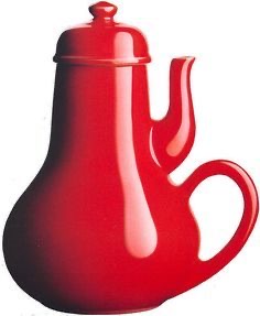
The pictured is of the Coffee Pot for Masochists, which dates back to Jacques Carelman’s ‘Catalogue of unfindable things’ (Catalogue d’objets introuvables, 1969). It has come to symbolize bad design, which, in my opinion (expressed here), isn’t technically accurate. And as any fan of “Futurama” can tell you, being ‘technically correct’ is the best kind of correct.
In the post in question, which I will not link to in order to avoid embarrassment, the author gave a picture meant to illustrate bad design, specifically, adding an affordance or feature that is redundant or unnecessary.
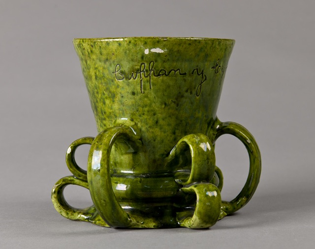
The above has 6 handles and seems to be ridiculous until you realize it isn’t a cup, it is a tyg, and this is where I’ll make two points, both related to UX. This is also the point where I begin struggling against auto-correct, which, unlike me, doesn’t like obscure words.
Point the first: know the requirements before you evaluate the design
The difference between a cup and a tyg is more than the difference in the number of handles. A cup is used by a person to hold a drink, presumably hot. A tyg, on the other hand, is intended to be used by more than one person, so the extra handles have a purpose: the users of tygs knew enough about germs to know that putting their lips in the same place as another person placed their lips is a great way to ‘lose God’s favor,’ i.e. get sick.
Tygs were used by royalty for toasts to symbolically seal a relationship and by peasants who couldn’t afford a cup of their own. Both didn’t have a clue about germs, but these people were observant enough to not reuse cups. As long as everyone held and used a tyg the same way (no lefty’s), hygiene was preserved.
So, ironically, a tyg is an example of very good design for the requirements. One could also argue that Carelman’s coffee pot is also a good design – if the requirement of a masochist is to feel pain, putting the spout for scalding hot coffee on the same side as the handle is a sensible design.
Standardized heuristics are great, but they are dangerous when applied without knowledge of the original use requirements. A designer with ‘cup use’ in mind would hack off a couple handles from a tyg and consequently potentially spread disease.
Point the Second: deep, possibly obscure knowledge is valuable
So how do I know so much about early renaissance drinking implements? No idea. My best guess is that I came across ‘tyg’ in a list of obscure English words. I’ve always loved trivia and obscure words, and still treasure the work day in which I was able to use “reticle” in a sentence and just hours later, “Kuleshov effect.” That was a good day.
I remember in the same company as above, I worked with a junior consultant who didn’t know what a Proper Noun is. I don’t expect Jeopardy levels of knowledge, but I was taken aback that a college graduate didn’t recognize “Proper Noun”. Considering we were working in the medical/pharma space, ignorance of terms being thrown around could be dangerous. I know there was a QA person working on the text who hopefully would catch mortal errors before they went to end users but I would have felt better if ALL employees had deeper knowledge of medical terms.
Most UX design isn’t life or death, but a deep level of cultural knowledge – even trivia – is valuable. When I was starting that project, I took the time to learn that tachycardia and arrhythmia are not opposites, but tachycardia and bradycardia are. This informed the design and avoided that moment when a medical professional had to correct my work.
Other knowledge – that Arabic is written right to left, that 8% of users are left-handed, that 8 times more men than women are colorblind, that blue is a color of mourning in some cultures, that Europe has dynamic speed limits on highways – might suddenly crop up as an important factor in a design, so I am arguing that a UX designer, to be more valuable, has to have a broad well of knowledge and if/when they are working in a specific industry, they should take some time to “learn the language” of that industry.
At the very least, pretend you as a UX designer are a lot like an actor, and if you need to say “decant your reticle” convincingly, you need to know what reticle and cant mean. And antimacassar, and chankings, and octothorpe, and transom, and oeil-de-boeuf.
And if you can describe the similarities and differences between a transom and an oeil-de-boeuf, while using the term mullion, get in touch! I got a free beer waiting for you in the Vieux Carré.

One thought on “Real Jeopardy”