One of the things that many companies collect and RARELY use properly are preferences. Preferences, if collected and converted to usable data, virtually eliminate the need for an interface for a lot of interactions.
As an example, I live in New York City, and have three airports to choose from when I travel. JFK is the one most know, because it’s the biggest. However, it takes $60ish to get there by cab and cab is virtually the only decent way to get there. You can get there by train for $7.50, but it takes 2.5 hours and at least one train change. I can get to Newark airport in about 30 minutes for $17.50 and a minimum of hassle. LaGuardia, on the other hand, is a $30 cab away (forget about getting there by train. It’s a ridiculous bus ride away).
As a result, Newark has about a $50 handicap for me (I’ll pay $50 more to go to Newark than JFK).
When I lived in DC, it was even more obvious. BWI is right on the train, but it’s way out of the city. National Airport on the other hand was just a couple metro stops away (sweet!). Dulles wasn’t even a possibility. I’d pay $150 to fly out of National over Dulles.
I don’t have any actual data, but I imagine this is similar for most people (although most probably don’t reduce it to numbers or a map, they just have a simple preference)
If you mapped that preference, you can probably get an idea of which airport is preferred.
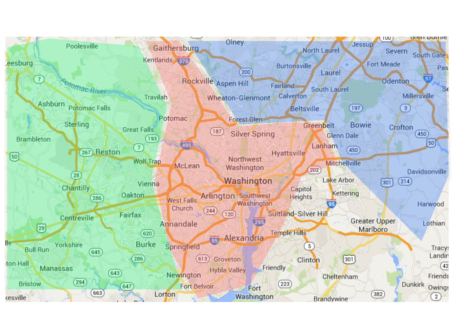
Of course an actual map would be much blurrier and have more mixed areas, but this is just an illustration of an idea. The shaded area represents the preference of the people who find it easier to get to National than the other two airports.
This information isn’t too useful to me, of course, since I am just a point of data on the map. It would be useful to an airline, of course, who could price flights accordingly if they know my address (nobody tell the airline this, please. I’m moving toward another idea, I just need this as an interim step).
This is just ONE data point in a long list of potential travel preferences. Imagine what we could do with multiple data points, each placed on a map with a ‘gravity’ given to each one.
For example, imagine if you were given a series of quick descriptions of potential roadside attractions (fun fairs, restaurants, music venues, malls, whatever your interest might be).

Gathering Preferences
The details of the gathering preferences is important, but the critical part is to get a NUMBER or some other comparable data point for each possible attraction.
These numbers (and the geo location of these attractions) can then be converted into something that can would normally be referred to as a heat map, but I think color doesn’t quite do it justice. I’d rather these items be converted into a Gravity Map.
When I say something is a “Must see!” I am, in effect, saying that I am willing to do X in order to see that attraction. If I rate it as a “Meh,” I’m saying I’m willing to do X/8 to see that attraction. All we have to do is convert that X into miles/hassle/traffic/cost, and we suddenly have a set of data that can create a remarkable result: A smart road trip planner:
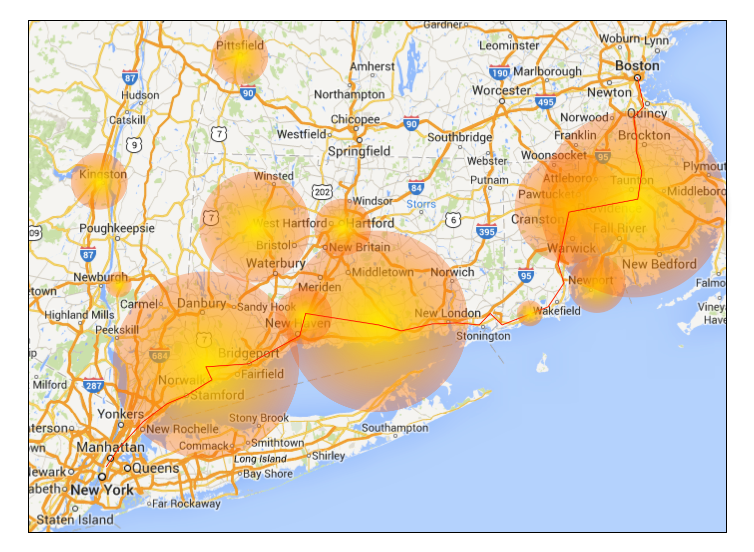
Gravity Map Road Trip Planner
With a set of preferences (attractions that I’ve scored based on how much hassle I’ll go through to see them), a destination (in this case Boston) and an hour value for free time for distractions, a simple algorithm can map out a great road trip. It would be a good idea to ask how “tight” a schedule is wanted, which will determine how crazy to make the schedule. In addition, I would borrow Google map’s ability to pick up and move paths, allowing me to overrule the planner to make sure to see the largest ball of twine or the world’s biggest pair of roller skates.
That is a road trip planner that asks only two questions, destination and free time.
Interestingly, I think this interface/process could also be used to sell cruises. I can’t speak for others, but I know that secondary or tertiary considerations I take into account before booking a cruise is what experiences are available in the various ports of call. It isn’t a primary interest, but that might just be because the cruise lines don’t really present that as a deciding factor.
Imagine an interface for a cruise line that presents a series of videos of possible experiences, all high quality, showing scuba diving, snorkeling, nightclubs, rafting, jeep tours, etc. etc. etc. Seriously, the number of things you can do on a cruise is stupefying – and along with each short video is a rating bar that lets you rate that experience as “Meh” or “Gotta Do!”.
It would be kind of fun to window shop for fun experiences rather than slogging through departure ports and costs per person and rebates and such. And once you were done, you’d get a simple recommendation saying that based on your desired activities, there are X number of cruises for you:

Cruise Gravity Map

One thought on “Preferential Treatment”