The Royal Road

I’m working on an heuristic analysis of the mobile site for Royal Caribbean and thought I’d drop my notes here rather than on some random file on my laptop.

I can hear my regular readers say, “cruises again?” Well, yes. But this time instead of revolutionary ideas or imagined apps, I am looking at an actual cruise company mobile site with an eye toward getting people into the sale funnel. Cruises are an interesting case because it is a relatively large expense – larger than users are comfortable making via a cell phone.

Keep in mind this is just first impressions and thoughts, not a strict evaluation. I’ll link the evaluation here when its done OR you can just poke around my assets folder and look for something starting with Royal Caribbean.
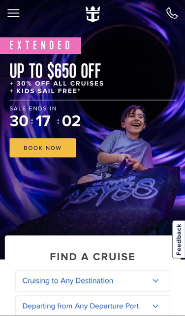
My first impression is that the sale space takes up an inordinate amount of space on the home page. I assume this is not normal. My other first thought is that this appears to be a straight up website, not a geo-fenced app – a lot of companies in the hospitality biz are creating websites which are location aware and if you go to the website when you are at the resort or on the ship, the website changes function completely and becomes an app for customers to manage their vacation. Since this app didn’t ask for location privileges, I assume it does not do this.

The visual design seems tight. All the colors are in tune, the fonts look under control.

The phone icon at the top right suggests to me that – what I was told 15 years ago – customers are still hesitant to order cruises online and prefer a phone call/agent. I’m sure this is shifting as the internet generations are getting into their cruising days, but it suggests a bit handholding and explanation would go a long way toward purchase.
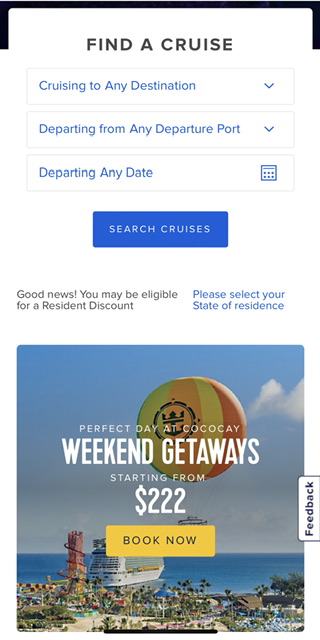
The ‘find a cruise’ is, unfortunately, about average for cruises. The assumption is that people will buy cruises based on destination. This is sensible, and I’m sure it is borne out by data, but this is where – MY OPINION – purely evaluating what exists fails to bring in the whole audience.

Where is the affordance for people who want to travel to go scuba diving? What about theme cruises? What about wedding cruises? I’m sure most are still shopping by location and date, but that doesn’t mean there aren’t people with other primary criteria in mind.

I was recently shopping for cruises with the criteria of “not too expensive, in port somewhere on New Year’s Eve,” and found it nearly impossible. The best I could do was select cruises by departure date and go through all the results. A disappointing experience, so I will not be taking a cruise this New Year.

Dates

A quick note about dates: Most cruises and travel sites in general seem to think that we have endless vacation time. When we choose to search by date, it is usually by departure date and then a supplementary affordance for length of cruise, and we are left doing math in our heads, trying to figure out if that fits our vacation window.

A better way to do this is to give a window start and end date and let me see cruises that fit within that time. Maybe a checkbox that says ‘allow for one day at beginning and end for air travel.’
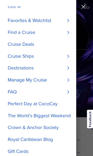
I see “Manage My Cruise” so maybe that’s where onboard functions are hidden.

I Royal Caribbean Blog really a top level item?

I like that Cruise Ships are a top level item. I’m not a cruise ship geek, but I know from my work with Hyatt that some people are hesitant to buy a cruise/resort stay and all aspects that they can ‘experience’ prior to purchase is a good thing. However, what I’d like to see is “What is it like cruising?” with subjects like “getting on board,” “how to find your cabin,” “No Seasickness,” “LIfe on Board,” “Never a dull moment,” and other items. If I could “experience” a trip in a video/multimedia section, I am much more likely to feel comfortable with purchase. (Again, these are impression notes, not an actual evaluation)
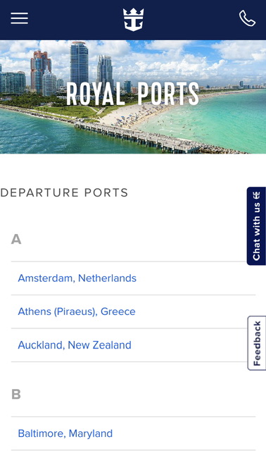
I like that they have each departure port listed, but it is a daunting list. This is also a failed opportunity in that each port should include a list of cruises that start or dock there.

I find this is a failing of sites in general, they all have endpoints and never think of them as entry points that users may drop into while trying to find tangential or ‘up one level’ info. If I did a search on Google for ‘Amsterdam cruise port,’ and thought I’d like to cruise from there, if I landed on this page, I would have to go to the top of the page and do a new search. A simple block showing which ship will be in this port and a note saying ‘visiting,’ ‘departing,’ or ‘debarking’ could lead to a sale.
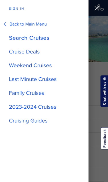
I like that “Family Cruises” is an option. I learned at Hyatt that family travelers are a big segment of the public, and if they get a hint of “non-family” content, they give it a wide berth. (“Wide berth” is an odd phrase, now that I’m in a nautical frame of mind.”)

But given the link that separates an audience, this list doesn’t really make sense. If it is a list of separable audiences, where are the others? Where are ‘Romantic Cruises’ or ‘Theme Cruises’ or ‘Adventure Cruises.’? I’d like to see more effort toward segmentation in order to give the respective audiences more concentrated and nuanced online content in order to induce sales.
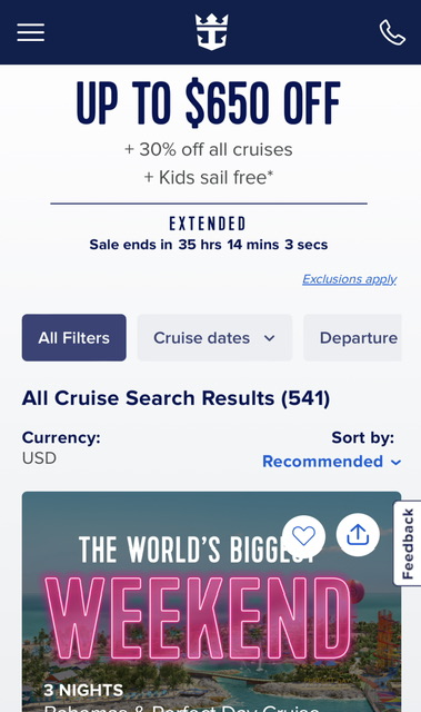
THIS is where I see problems. I’ve already performed a simple search, and am anticipating results, but too much of the screen is taken up by ads. I have not searched on ‘kids cruises’ nor ‘weekend cruises’ so why am I being tugged toward those types of cruises? Show me my results! The results are of course below, but why make me scroll through ads in which Royal Caribbean should KNOW by now I’m not interested? If it must include an ad, make it one that conforms to my search.
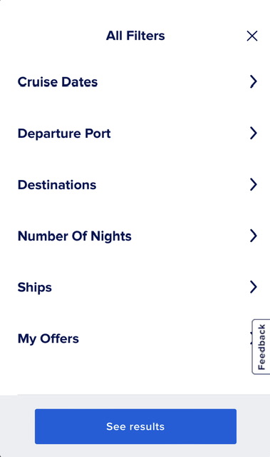
I like the distance between options – lots of fat finger space. I’ve already mentioned the ‘Number of Nights’ x Dates failure. I am surprised ‘Ships’ is so prominent. Are there that many dedicated cruisers that picking by ship rather than other criteria is of primary concern?

The Royal Road

If you’re wondering about the headline, I’ll explain. The “Royal Road” is just a common phrase in UX to designate the primary path through an experience. If you shop at amazon, the Royal Road is search, primary product page(s), add to cart, checkout. That is an ideal experience, and a more typical experience is much more convoluted. The job of the designer is to give signposts and, in some cases, strong arm the user onto the Royal Road to effect a sale. If a user gets off the primary path toward sales, we put up all manner of enticements and redirects to get the user back to where they should be. It is a subtle art as redirects might seem to draw off the primary path, but as I often must remind product managers, yes, we want to get the user to the checkout, but just as importantly, we want to get them to the checkout with confidence that they have found the best item for them at the best price.
Vacation, all I ever wanted

Years ago I interviewed with Site59, an amazingly cool travel startup. I didn’t get the job, but ever since then, I’ve been fascinated by the problems in travel and how digital technology can potentially solve them.

I’ve been monitoring the Open Travel Alliance (OTA), and the promise of this effort is substantial – so substantial that I’ve been endlessly frustrated but the slowness of the Alliance.

The OTA promises the possibility of opening up every aspect of travel to whatever interface you want. They are creating an XML scheme that describes everything you can think of in the travel field and – IF it is adopted by the industry – allows any app or website to book hotels, flights, train tickets, tours, you name it.

If implemented correctly, the OTA data should enable some really cool interfaces in which people can plan their travel a bit more visually, a bit more collaboratively and most importantly, with more confidence that the tour they booked halfway around the planet is a real thing and is worth the time and effort.

I’ll say upfront that this is a very personal interface because I travel every year with friends and I can tell you trying to keep track of when everyone is arriving, who wants to do what when, what attraction is open when, booking reservations etc. is a pain and e-mail is usually the default app, even though it is probably the worst. I am the audience for this app. Your mileage may vary.

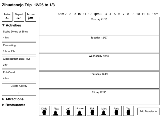
I want an app that gives me a travel calendar, with objects that represent timeobjects that represent participants, and objects that represent attractions/tours and a way to put all of these together intelligently.

So let’s build it.

This interface assumes relatively independent adults, and each is represented in the interface and each is allowed to propose activities and to join in activities. Rules would have to be decided (probably as a preference setting) as to who can book an activity vs. who can propose an activity.

Image

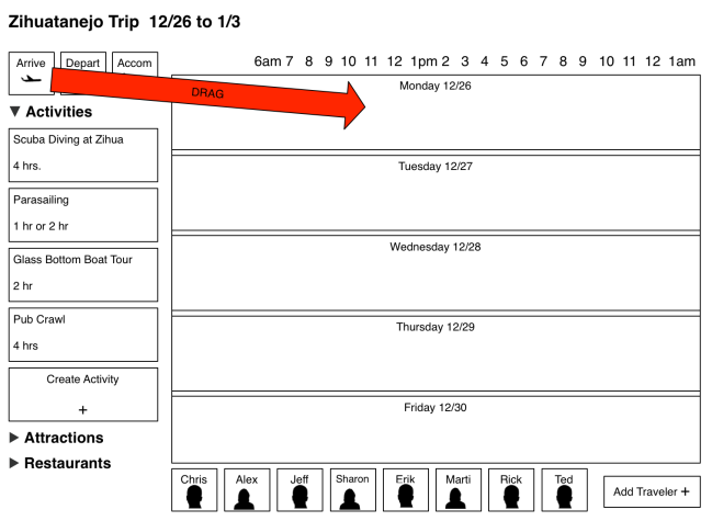
Each trip gets a series of day boxes equal to the trip duration.

Each person who is invited to this planner have the opportunity to note their arrivalenter the details of their accommodations, and most importantly, propose and/or book activities. All by drag/drop/define.

Image

A user initiates arrival notation by dragging the ‘Arrive’ icon onto the day they will arrive.

As a general rule, airlines use the same flight number for a specific route at a specific time, but not for a specific day. It isn’t critical that the user drag the icon into the proper day they will arrive since they can later drag it from one day into another, but the interface will assume the day dragged into is the day the user will arrive.

Image

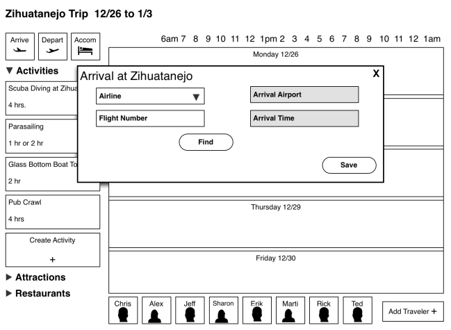
User finds/fills in his/her arrival details.

Ideally, the user will be able to enter their airline and flight number and get detailed flight info from a flight tracker system. Failing that, the user is able to enter the time they will arrive.

NOTE, the arrival is “empty” – there are no people attached to that arrival at this point, and that is intentional. In order to simplify the process and avoid a very complex interface where the user chooses the arrival and the people, the two operations are split. Later, this process will be repeated when activities are proposed.

Image

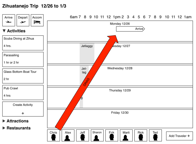
The user designates WHO is in a specific arrival by dragging the user icon onto the arrival arrow.

Arrivals are represented by an arrow shape, the right point of which represents the scheduled arrival time.

Once a user is assigned to an arrival, a little work is done in the background. The system would find the user’s home address, find the destination address and then calculate the number of time zones the user is crossing (and which direction, east or west they are traveling). This allows the system to put in ‘jet lag’ warnings so the user knows not to schedule things early in the morning (or late at night) when they may be groggy. The Jet Lag shade gets smaller by one hour per day (the average recovery time) and users are free to ignore it; It is just a shade on the schedule.

Image

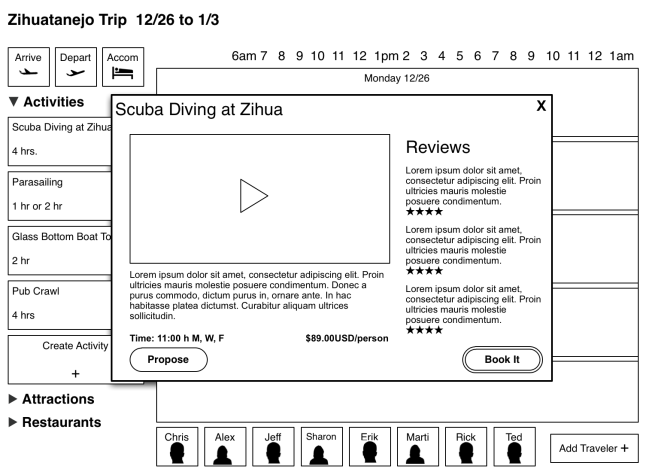
On click of an activity, the preview pane is shown over the interface.

Now the fun part – doing things. Assuming you can gather activities and attractions from multiple sources (TripAdvisor would be the prime source), you should be able to schedule it by dragging the item into the schedule and then populating it.

If you aren’t sure you want to book it, you can click on the activity and get the preview pane shown above. It would include (hopefully) a video or slideshow, a description, some details of the activity (including schedule details) and reviews from previous users.

On the right is a “Book It” button that would go to whatever site required to actually book the activity.

On the left is a “propose” button that, on click, converts to a button sized object so the user can propose the activity for a specific time/day by dragging it onto the schedule block.

Image

Click the propose button to get an icon that lets the user propose a time/day for that activity. NOTE the available times of the activity are marked on the schedule bars to assist planning.

As with the arrival scheduling, the proposal of an activity is “empty” of participants. On drop of the proposal icon, a box is created that lets the user populate with people – or more importantly, for each person involved to agree to do that activity.

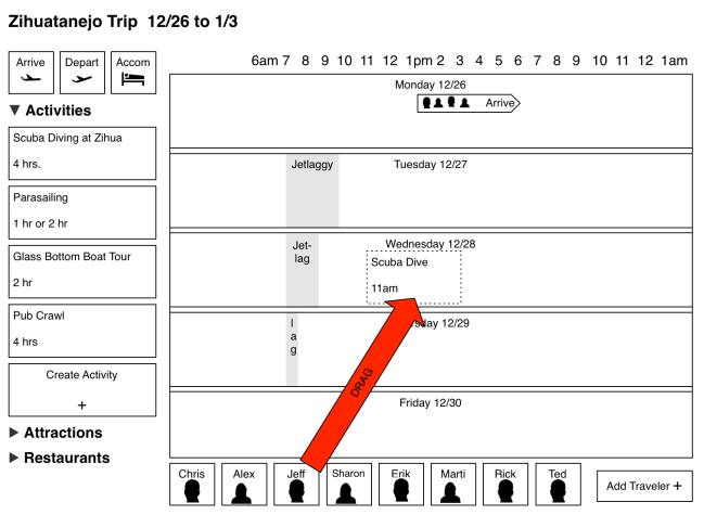
Image

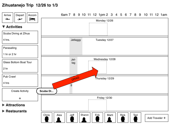
The proposed dive is now a dotted line box that takes up 4 hours (info from the activity database) on Wednesday at 11am (again, info from the database). Users join in by dragging their icon into that box.

Just as with the arrival icon, the proposed dive activity becomes a box/target and the user can populate that proposed dive by dragging icons representing people into that box.  This action could target an invite, or not, depending on the group/individual preferences.

Note there is a visual difference between “proposed” activities and “booked” activities. Although not part of this interface sketch, it could either handle the booking locally or by sending the user to an external website. Either way, once an activity is “booked” it is locked in place in the schedule and user’s can’t be dragged into that box without sending out a warning to the activity owner.

Until an activity is booked, the date/time can be changed by simply dragging the icon in the schedule space (within the parameters set by the activity).

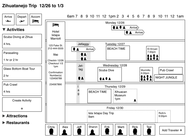
Image

The populated schedule shows activities and participants and distinguishes between booked and proposed items.

Note on the left of the schedule, we now have accommodation details. If the travelers are staying at different places, this can be represented by multiple vertical bars. Each accommodation item is clickable and will bring up the booking details, reservation numbers, etc.

Also note, there are “Beach Time” blocks, which represent the user created items. Those will be freeform, letting the user define virtually any possible activity since even the best database can’t cover everything.

If you like this interface and would like to use it, please contact Booking.comOrbitzTripAdvisor and TripIt and tell them you want this functionality.

We got movie sign!

The movie business has up until now, weathered the internet onslaught fairly well. With a few hiccups, the industry has moved through VHS, DVDs and now into movie downloads with most of their structures intact.

Let’s mess with it.

I grew up with movies, worked as a projectionist and got a film studies minor. I’ve seen a TON of movies and like most people, I can tell in a matter of seconds whether I’m interested in a movie or not. Even more than that, I can gauge how much hassle I’ll put up with to see a movie. On occasion, I’ll be undecided on a film and will look to a critic’s recommendation and when I do, I’m usually satisfied with the “4 stars” or “B+” rating.  On very rare occasion, I’ll actually read a review of movies and that will decide if I want to see it.

So why isn’t there an app that matches that process?

The other major problem with movies in the many formats in which we can consume them is that this is where the process ends unless someone or something reminds me a movie is premiering or on cable or something. I see a preview, decide I want to see it, and never hear of the film again, often until it has left theaters.

Really, there should be an app that keeps these ratings of movies and reminds me when the movie is available in the format I have chosen.

So let’s build an app that matches the process of rating movies based on how we want to see them and then reminds us when they are available in that format.

Here’s my decision making process in micro format:

1) Discover film is coming up

2) See synopsis of plot, see who is in it, if enough info, go to #6

if not:

3) Watch preview. If enough info, go to #6

if not:

4) See the critic rating.  If enough info, go to #6

if not:

5) Read review from favorite reviewer in order to

6) Decide how much money/time/effort I will invest to see a movie.

Once we figure out the process, the UI is fairly easy, but I’m going to add one wrinkle – because I have an inherent bias against abstract number/star/grading systems. The problem I have with them is that they present information in a format that I, as an interpreter, have to assess in order to take action. Why not build that assessment into the interface as a preference?

Rather than rating movies based on a scale of zero to five, I’m going rate movies base on how much time/money/effort I am willing to undertake in order to see it.

0= Actively Avoid
* = See on Broadcast
**= See on Pay Cable
***= See on Netflix/Amazon/iTunes
****= See in Movie Theater
***** = See in Movie Theater on Opening Day

The normal interface convention says that the user will be presented a way of rating movies in a series of stars (the key of the key-value pair), which is fine if the intent of the rating is public consumption, since the meaning of each star rating is personal. But if I assume the use is entirely personal, I believe that the value (See on Broadcast, See on Pay Cable, etc) is the pertinent information.


Image

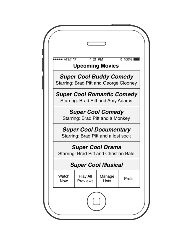
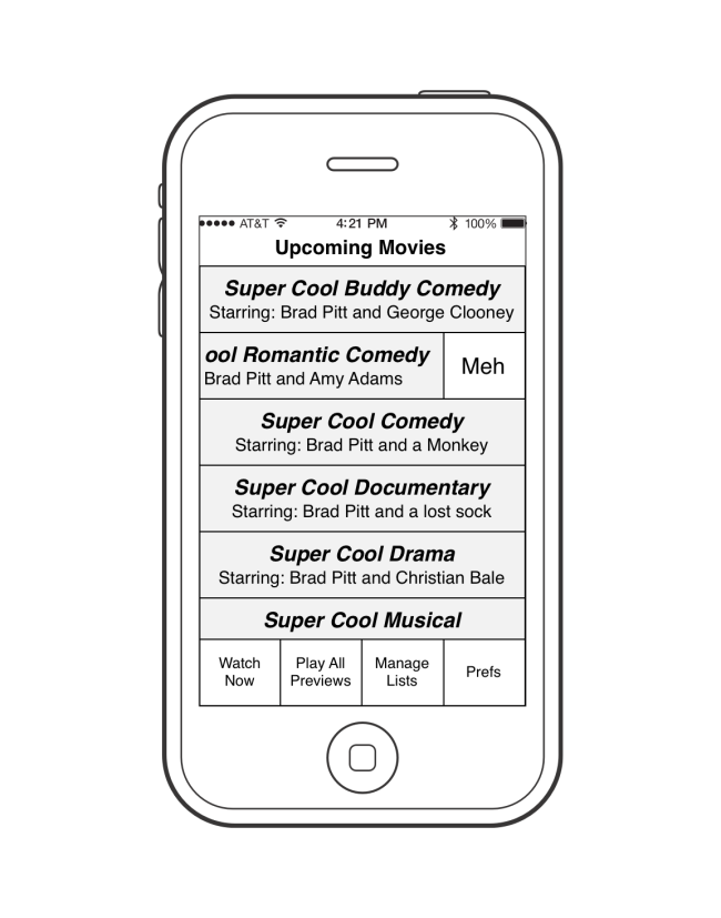
The Basic Interface is a list of movies that are known to be premiering soon.

Note this is the ‘speed’ version of the interface. It allows the user to quickly rate a film as worthwhile or “Meh.” (not interested). Yes, “Meh” is a bit of fun, and in a real app the label would be something like “Delete”.

If the user has more time to invest, there is a Play All Previews button, the interface of which (not shown) would mirror the experience in the theaters when you watch 10 or more previews. The difference is that there would be a control to let the user rate the film based on his/her level of interest.

Image

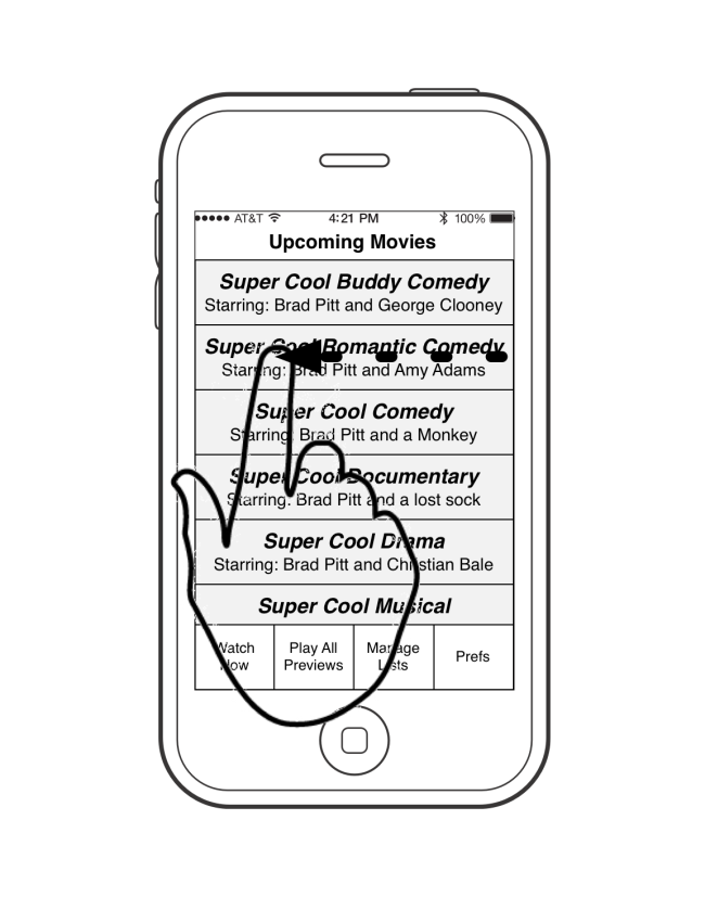
Swiping a movie to the left reveals the “delete” button.

Image

A tap on the “Meh” button will remove a movie from the user’s queue permanently.

Image

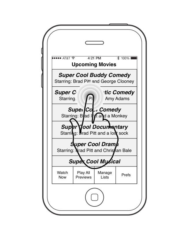
A tap on a movie title or a swipe to the right will reveal the preview screen.

Image

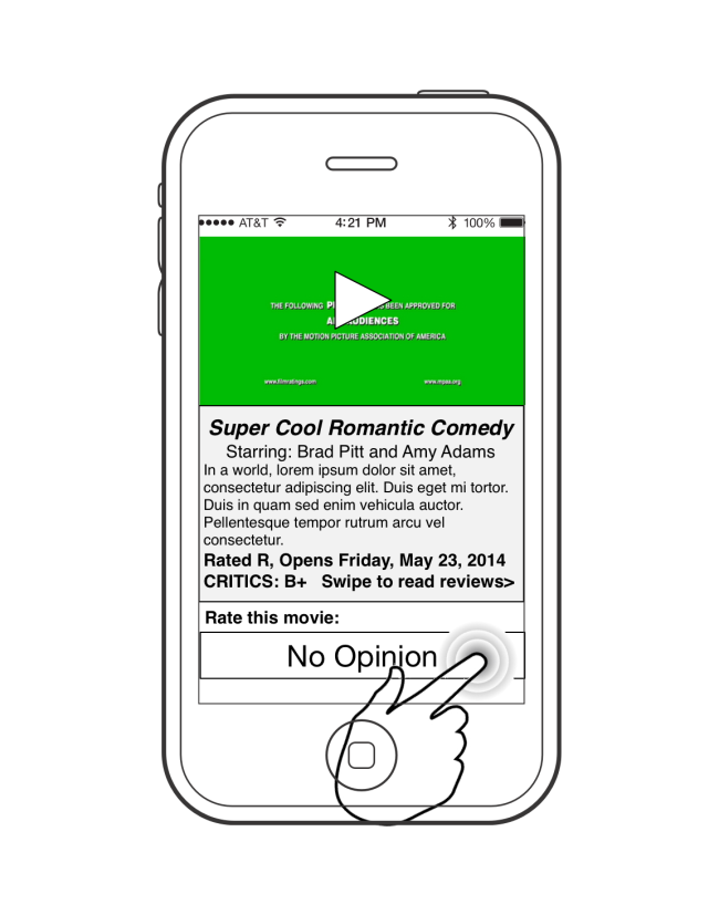
The preview screen allows the user to read the synopsis and watch the official preview (if available).

Swiping to the right on the synopsis will bring up a screen of critic reviews. Those reviews, in turn, will be linked to the full reviews which will be read in the user’s default browser.

A swipe left will return the user to the upcoming movie list.

Image

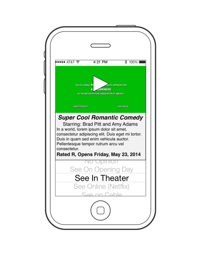
Finally, the user will use a selector to decide whether and how they will see the movie.

What happens after the user has rated a movie? That would be up to a preferences screen (that I won’t bother drawing). I imagine it would use the mobile device’s alert system so that when a movie premiers, the user will be notified and sent to a ticket buying app (Fandango is my favorite). If the movie was rated as ‘See on Netflix‘ the user will be notified when it is available on that service. Finally, using a TiVo or similar service, the user will be notified if/when the movie will be shown on broadcast.

This is a sketch. A complete app writeup would include a preferences pane, a list of related apps, and most importantly, a way of making money.

Making Money with this App

I foresee two different ways of making money on this app. The most basic is to use Amazon and other companies referral system, so that when someone buys a movie from this app, the author would get credit. Sure it is only a few pennies per movie, but that could easily add up.

Secondly, I imagine the studios and the chain movie theaters would KILL for the aggregate ratings of each movie before they premier IF enough people use the app to give a reliable idea how well the movie will do and how much money the movie will eventually return (keep in mind even “Watch on Broadcast” is important information).