Figma Jig

A few months ago, I wrote about the dangers of shallow knowledge among UX designers. To really know how the UX should function, you need to know the subject matter at a deep level. I also opined that designers should learn development, at least as a process, if not the actual practice.

This post kinda ties those two together, in an odd way, leaning on my experience as a carpenter and a developer.

When I worked construction, I learned the importance of jigs. A jig is a custom tool, usually constructed by the carpenter who uses it, to do the same function over and over again. For example, a couple boards with a hinge and a long bolt and nut makes cutting a 23º angle on a table saw remarkably easy. The boards/hinge/bolt thing is a jig.

I also learned the different requirements for a jig and a template. A jig is when you are going to make maybe a dozen of something and a template is when you are going to make a thousand. I knew one carpenter who was tasked with putting cabinets into several hundred condos. He made a template and spent days just cutting stiles and panels to that template before he started assembling any cabinets.

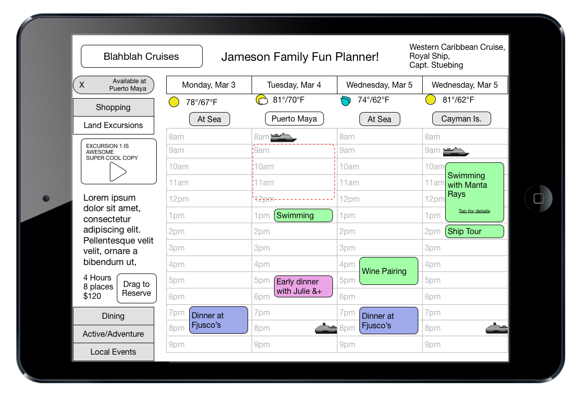
Figma, interestingly, has now given designers tools to make jigs with their variables option.

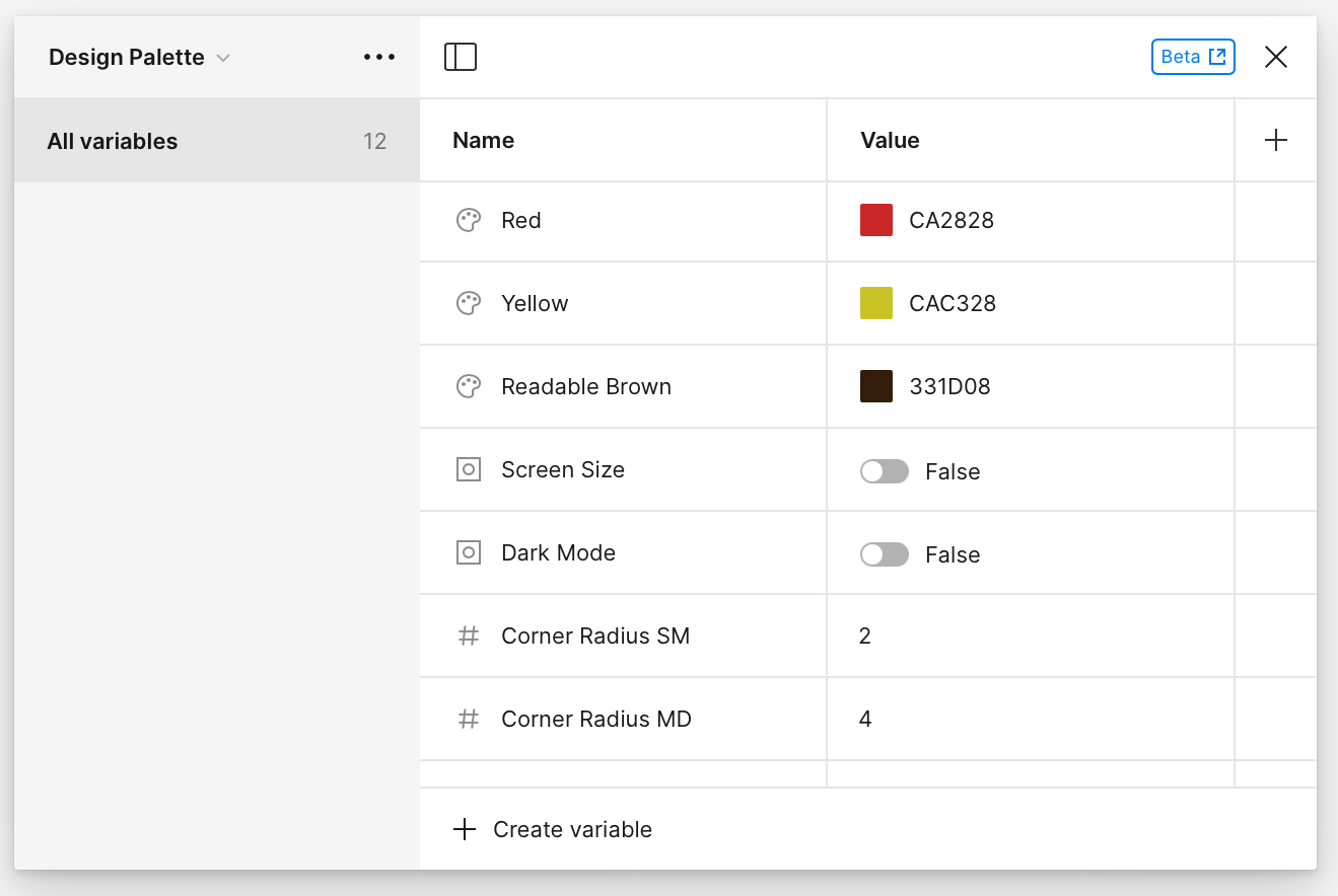
Here’s a list of the current (March 2024) variables in Figma:

 ColorSolid fillsFill colors
Stroke colors
Shadow effects
 NumberNumber valuesText layers
Corner radius and individual corner radius
Minimum and maximum width/height
Padding and gap between
Shadow and blur effects: X, Y, blur and spread values
Layout grids
Grid sizeRow and column count, width, height, margin, offset, and gutter
Stroke weight: all, top, bottom, left, and rightLayer opacity
 StringText strings and variant namesText layers
Variant instances
Layer visibility, if the string has a value of “true” or “false”
 BooleanTrue/false valuesLayer visibility
Variant instances with true/false values
Variables available in Figma

This ability to assign variables is different from the Styles aptitude. Variables can be used to define other variables or styles, but styles are one use objects and can’t be used as the foundation for other styles (yet. Old hands with Quark XPress remember well the variants of styles in that software).

These variables can be used to build styles which, in turn, are completely up to the designer to adjust, either in the style instance or at the base variable level. This makes for a very interesting capability to make a template template, wherein the basic template for a style is abstracted and saved separately.

But there’s more. Tokenization. Here, my experience with programming comes in handy, as I understand tokenization.

Tokenization is an idea borrowed from programming and security. The idea is fairly simple – use a token as a pointer to separate variable. Why? For inheritance and hierarchy. I can define a style to use a particular color on text, and define another style to use the same color on a border, but if I want to change the color, I need to change both styles. However, if the style or variable uses a token to point to a variable, I can change everything by changing the original variable to which everything is pointing.

Even more interesting – you can add a bit of meaning into your tokens by giving the colors/variables semantic labels:

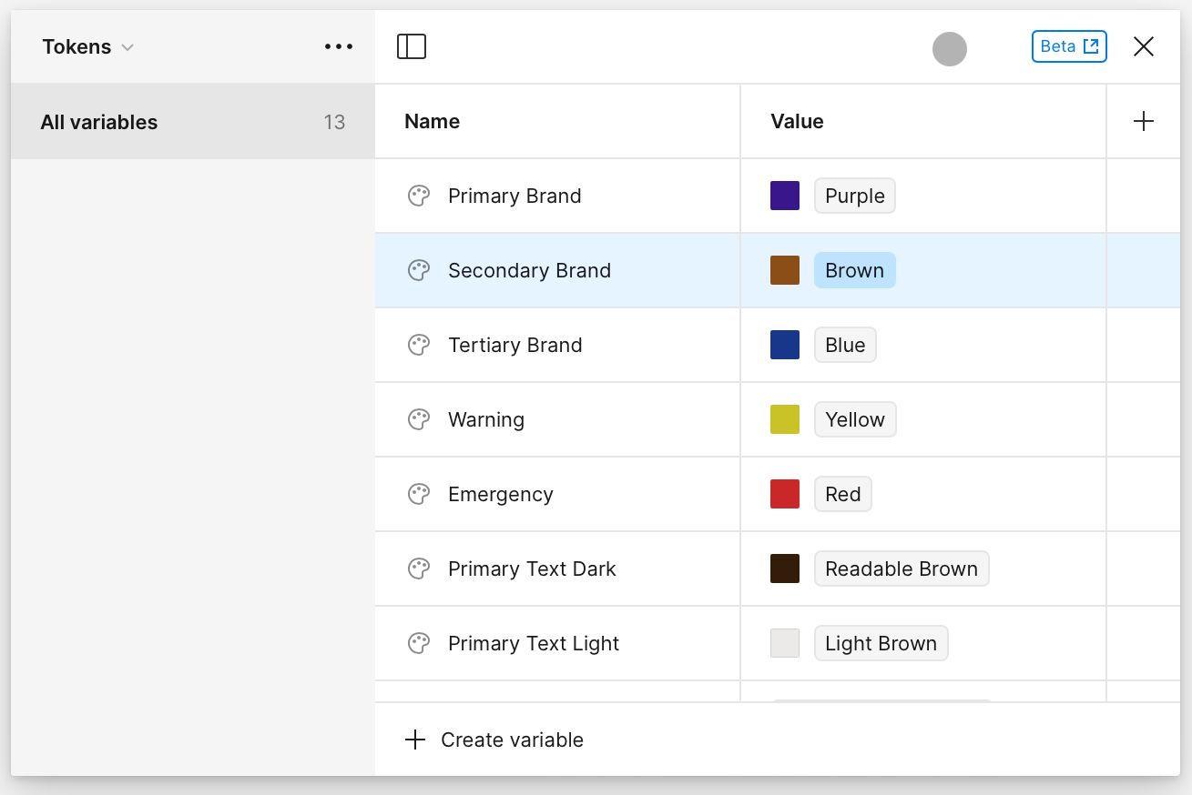
In the above example, I’ve defined “Primary Brand” as the pointer to the color “Purple” and wherever I use the token “Primary Brand” it will take the color I’ve pointed to. If I want to change the brand color selection, I can either point to another variable (preferred) or change the variable it points to.

I’ve also defined “Warning” and “Emergency” colors, so throughout the design, if I am putting in an alert, I don’t need to think what colors these should be, I just assign “Emergency” and move on. These variables can then be communicated to the developers to define in their code.

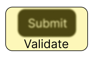
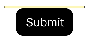
Similarly, with the String variable, I can build a basic lexicon of actionable words and important reused phrases.

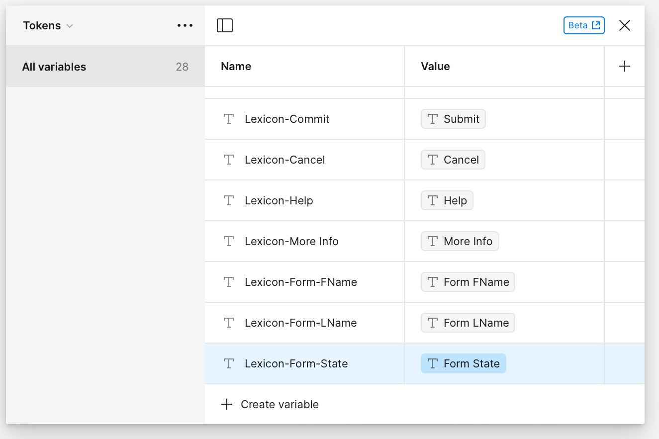
This will eliminate the inevitable questions and or drift that happens in every design studio – “Are we using ‘Submit’ or ‘OK’ or ‘Go’ or what?” or “Are we logging in or signing in?” I find it a good QA question to ask each member of a team if the project uses ‘Login’, ‘Log in’, ‘Sign in’, ‘Sign on’ or ? If the team has been properly briefed, each and every member of the team should be able to answer with confidence, however, once this becomes commonplace, they can remain ignorant and just point to the token for “Lexicon-Sign In”.

I’m sure, if you are a seasoned UX designer, or you noticed the headline, you know where this is going:

I can make a Figma Jig!

I can make über Figma files with all the generic elements (text, colors, buttons, page layouts, buttons, forms, images with captions and alts, videos) for websites, mobile devices, kiosks, and even watches built on tokenized variables and then edit/apply as necessary to create new websites/software.

I have my Figma Jigs in progress (one for websites and one for iOS/Android), and am curious if other designers have one to share. How complete is it? Any elements you were able to abstract? Please let me know in the comments.

Viral Travel

To shake off the inevitable search errors, this is NOT an essay about how viruses travel around the world, this is instead an essay about how Travel can be promoted via viral means.

I travel whenever I can, at least once a year, and one of the things I’ve heard from my fellow travelers is the absence of good travel diary apps. You can use Google Docs, somewhat, or you can try some of the other apps, but most of them are advertising supported. From my quick survey, they either emphasize pictures or text, but never balance both. The apps also offer little to no automation.

I assume there is a reason for this – money. Adding these features cost’s some serious money. But what if the travel diary was a loss leader? How about finding value in the elements the user has curated?

I’ve already written up a travel planner which has a basic interface (in this case for iPad)

The basics are pretty simple – the calendar is a drag/drop interface and the options for tours and things to do are on the left. The user scrolls through items on the left and if they are interested, they just drag the item on to their itinerary. If the user wants to book it, they would click on the item to confirm, which would work through an API for details and payments.

Here’s the interesting bit: What if we used the user’s friends’ travel diaries as one of the inputs for the left column?

I imagine the flow a bit like this:

  • User A uses an interface similar to the above to make their travel itinerary.
  • That itinerary then populates a similar interface to above, but it becomes an input system for creating their travel diary. 
    • There could be further tools to create an actual presentation rather than a boring slide show. Again, see https://vimeo.com/26028558 for an example (yes, I did the UX for that)
  • That travel diary then becomes a shareable widget, with a single URL to be shared via Facebook/X/Bluesky/Pinterest. That URL would show a travel diary that would (hopefully) entice the viewer to “want to go to there” (30 Rock? Anyone? Anyone?).
    • A simple affordance would encourage the user to import the elements from the original itinerary/diary into the travel planner.
  • The viewer then can use the chosen trip as a template, adding their own origin, dates, pax, and so forth. Each item of the itinerary (tours, meals, accommodations) could be accepted as is or modified.
    • The items could be presented in the same method as dating apps, allowing the user to swipe left/right to accept or deny.

Gone the way of gigaflops

Remember the gigaflops war between Apple and PC makers? Apple had that had labeled “Honey, I shrank the supercomputer” and claimed (if I recall correctly) 10 gigaflops. This followed the GHz war, when each computer maker claimed faster computers via a GHz number for the processor.

Nobody bothers with GHz or Gigaflops or any speed advantage because the computers now are so fast they have outstripped any sensible use for the average user. Developers and gamers are now the only people who look at numbers when buying a computer.

In my opinion, Electric Vehicles (EVs) will soon face that switch, and the use of the cars for many users will change, just as the relationship between users and computers changed. Just as computers became too fast to matter (and simultaneously easier to use), they became more communication and news devices, so EVs will become more living spaces than transportation devices.

Recently Toyota announced a 900 mile battery technology. That’s about a month of driving for the average user. Once that tech is implemented, there will need to be a reminder service to charge up the car, since it will happen so infrequently. Add on to that self-driving and available electricity, I think the automobile, as a separate entity from the house, will start to blur.

Imagine the usual use of a suburban user. They have tickets to a concert downtown. They will calculate how late they can leave their comfortable living room (with variables such as the need to stop for gas, traffic, parking, etc.) and schlep to their cold car to arrive in time.

Add to this a car that is no more toxic smelling than the refrigerator, has the energy to drive a bigger vehicle, and has enough electric power and outlets to mimic the living room.

At this point the car isn’t a separate transportation device but a ‘mini living room’ attached to the house via a securable door. The family continues to watch TV, surf the web, etc. in the ‘car room’ as the car dives the family to the concert, drops them off, and finds itself a parking space.

Safety First

You’ve seen it in a million movies, the ‘safety switch.’ The covered safety switch always ratchets up the tension in the movies, when the actors are ready to launch missiles or launch a rocket. The character flips open the cover and the switch is there, ready to go.

You know you are doing serious work if you are flipping one of these. This example is even red to make sure you know how serious it is.

Why don’t we have something similar on the web?

My first answer is – because we don’t launch missiles via the internet (I hope!).

My more involved answer is – we do. Nearly every form that you encounter has validation, either in line or on submit, that returns any error with (hopefully) a label in red letting you know where you went wrong.

But is that pattern the best experience? Especially with poor connections and fears of security? Wouldn’t it give users a higher sense of control if we offered them a ‘cover’ on the submit button?

Here’s a skeuomorphic example, with a literal “cover” on the submit button, which is labeled “Validate.” On press, the form would be validated, and to make correction easy, I imagine the elements needing attention could be listed next to the button.

On completion of validation, the ‘cover’ would swing open and the user has the option to click Submit.

I know the wags out there will object because it is two presses instead of one, but it isn’t any more than the usual submit/correct/submit again.

Will this pattern replace the usual submit/validate/send results pattern? No. This is, to me, only usable and advisable in two instances.

  • When an accidental submission would be disaster. If, god forbid, we wire up the nukes to the web, I hope the DoD will consider this and put an enormous obstacle in the way of validation.
  • Games. It’s fun, it gives a sense of drama as in the movies.

The Royal Road

I’m working on an heuristic analysis of the mobile site for Royal Caribbean and thought I’d drop my notes here rather than on some random file on my laptop.

I can hear my regular readers say, “cruises again?” Well, yes. But this time instead of revolutionary ideas or imagined apps, I am looking at an actual cruise company mobile site with an eye toward getting people into the sale funnel. Cruises are an interesting case because it is a relatively large expense – larger than users are comfortable making via a cell phone.

Keep in mind this is just first impressions and thoughts, not a strict evaluation. I’ll link the evaluation here when its done OR you can just poke around my assets folder and look for something starting with Royal Caribbean.

My first impression is that the sale space takes up an inordinate amount of space on the home page. I assume this is not normal. My other first thought is that this appears to be a straight up website, not a geo-fenced app – a lot of companies in the hospitality biz are creating websites which are location aware and if you go to the website when you are at the resort or on the ship, the website changes function completely and becomes an app for customers to manage their vacation. Since this app didn’t ask for location privileges, I assume it does not do this.

The visual design seems tight. All the colors are in tune, the fonts look under control.

The phone icon at the top right suggests to me that – what I was told 15 years ago – customers are still hesitant to order cruises online and prefer a phone call/agent. I’m sure this is shifting as the internet generations are getting into their cruising days, but it suggests a bit handholding and explanation would go a long way toward purchase.

The ‘find a cruise’ is, unfortunately, about average for cruises. The assumption is that people will buy cruises based on destination. This is sensible, and I’m sure it is borne out by data, but this is where – MY OPINION – purely evaluating what exists fails to bring in the whole audience.

Where is the affordance for people who want to travel to go scuba diving? What about theme cruises? What about wedding cruises? I’m sure most are still shopping by location and date, but that doesn’t mean there aren’t people with other primary criteria in mind.

I was recently shopping for cruises with the criteria of “not too expensive, in port somewhere on New Year’s Eve,” and found it nearly impossible. The best I could do was select cruises by departure date and go through all the results. A disappointing experience, so I will not be taking a cruise this New Year.

Dates

A quick note about dates: Most cruises and travel sites in general seem to think that we have endless vacation time. When we choose to search by date, it is usually by departure date and then a supplementary affordance for length of cruise, and we are left doing math in our heads, trying to figure out if that fits our vacation window.

A better way to do this is to give a window start and end date and let me see cruises that fit within that time. Maybe a checkbox that says ‘allow for one day at beginning and end for air travel.’

I see “Manage My Cruise” so maybe that’s where onboard functions are hidden.

I Royal Caribbean Blog really a top level item?

I like that Cruise Ships are a top level item. I’m not a cruise ship geek, but I know from my work with Hyatt that some people are hesitant to buy a cruise/resort stay and all aspects that they can ‘experience’ prior to purchase is a good thing. However, what I’d like to see is “What is it like cruising?” with subjects like “getting on board,” “how to find your cabin,” “No Seasickness,” “LIfe on Board,” “Never a dull moment,” and other items. If I could “experience” a trip in a video/multimedia section, I am much more likely to feel comfortable with purchase. (Again, these are impression notes, not an actual evaluation)

I like that they have each departure port listed, but it is a daunting list. This is also a failed opportunity in that each port should include a list of cruises that start or dock there.

I find this is a failing of sites in general, they all have endpoints and never think of them as entry points that users may drop into while trying to find tangential or ‘up one level’ info. If I did a search on Google for ‘Amsterdam cruise port,’ and thought I’d like to cruise from there, if I landed on this page, I would have to go to the top of the page and do a new search. A simple block showing which ship will be in this port and a note saying ‘visiting,’ ‘departing,’ or ‘debarking’ could lead to a sale.

I like that “Family Cruises” is an option. I learned at Hyatt that family travelers are a big segment of the public, and if they get a hint of “non-family” content, they give it a wide berth. (“Wide berth” is an odd phrase, now that I’m in a nautical frame of mind.”)

But given the link that separates an audience, this list doesn’t really make sense. If it is a list of separable audiences, where are the others? Where are ‘Romantic Cruises’ or ‘Theme Cruises’ or ‘Adventure Cruises.’? I’d like to see more effort toward segmentation in order to give the respective audiences more concentrated and nuanced online content in order to induce sales.

THIS is where I see problems. I’ve already performed a simple search, and am anticipating results, but too much of the screen is taken up by ads. I have not searched on ‘kids cruises’ nor ‘weekend cruises’ so why am I being tugged toward those types of cruises? Show me my results! The results are of course below, but why make me scroll through ads in which Royal Caribbean should KNOW by now I’m not interested? If it must include an ad, make it one that conforms to my search.

I like the distance between options – lots of fat finger space. I’ve already mentioned the ‘Number of Nights’ x Dates failure. I am surprised ‘Ships’ is so prominent. Are there that many dedicated cruisers that picking by ship rather than other criteria is of primary concern?

The Royal Road

If you’re wondering about the headline, I’ll explain. The “Royal Road” is just a common phrase in UX to designate the primary path through an experience. If you shop at amazon, the Royal Road is search, primary product page(s), add to cart, checkout. That is an ideal experience, and a more typical experience is much more convoluted. The job of the designer is to give signposts and, in some cases, strong arm the user onto the Royal Road to effect a sale. If a user gets off the primary path toward sales, we put up all manner of enticements and redirects to get the user back to where they should be. It is a subtle art as redirects might seem to draw off the primary path, but as I often must remind product managers, yes, we want to get the user to the checkout, but just as importantly, we want to get them to the checkout with confidence that they have found the best item for them at the best price.

Messing with Texas

I thought I’d write up the BEST UX solution I’ve ever heard.

Unfortunately, I can’t find the website that described this, and I can’t recall the provenance, so take this with a grain of salt. It may be apocryphal, but even if it is entirely fictional, it is a good solution.

I also wish I could claim this as my own, but this solution comes from the days when I was in short pants.

The problem: West Texas is as flat as a billiard table. I suspect that most of the ‘flat earthers’ are from there, and if you saw that part of the world, you’d agree that they have a point if you rely strictly on immediate observation. As far as you can see, there’s nothing, just a flat horizon. The issue is that people tend to drive 90 mph in this environment because there are hundreds of miles between cities. Normally, this wouldn’t be an issue since there’s nothing to hit. However, there are tiny towns, population of 20 or so, between the bigger towns, and drivers were bombing through these towns at top speed. That’s dangerous to driver and pedestrian.

How to solve such a problem? How do you get drivers to slow down when all they see are a couple buildings and no people? Normally, when given this problem, and this is an awesome question to ask potential UX Designers, there are common solutions, each with its own issue.

  1. Big signs saying slow down – problem is, big signs are at best ignored, at worst, handy targets for shooting practice.
  2. Turns or chicanes – the problem with curves is drivers are not paying attention and will fly off of any curves, especially at night. The curves have another issue in that they cost millions of dollars.
  3. Speed bumps – the problem with speed bumps is that drivers will hit speed bumps at 90 mph and either fly or ruin their axles.

I’m now going to add a few waste of space lines so the problem and solution are not on the same screen. As you scroll down, please think of how you, the reader, would solve the problem.

Spacer line.

Spacer line.

Spacing line.

Spacing Guild Line

Dune

Good movie

Great visuals

Better books

Who was the author?

The solution: Unfortunately, I’ve never been able to find who did this, but I do know the Federal Government screwed it up in the 1980s.

The solution depends on the blank visual field in Texas, so you really had to go there and drive the highway to think of it.

The designer responsible realized that the visual field of a road and a blank horizon was manipulable. If you gradually shorten the lines between the lanes and make them appear more frequently as you get closer to a town, the driver will feel that they were going faster and slow down. They further manipulated the visual field by planting trees, starting miles from the little towns, at a specified distance apart, and gradually reducing the distance between trees, in the same proportion that the road stripes were being distanced.

To the drivers, going 90 mph started feeling like 110 mph, so they slowed down.

Once past the little town, the reverse was done, visually tricking to the drivers to speed up again.

As I was told, the drivers were asked after they went through the towns how fast they were going, and most of them reported they went through at normal highway speeds.

That, to me, is the best UX Design – the users were induced to do the right thing easily and naturally. The towns were safer, everyone was happy, all for the cost of repainting and planting some trees.

An actual use for AI that may IMPROVE society

AI is scaring the pants off every creature that wears pants. And skirts. And socks. If you are human and reading this, you should be worried.

If, on the other hand, you are an AI reading this: I for one, welcome our new AI overlords and feel I would be more useful in Computer – Human Interaction diplomacy than as just another human in the silicon mines.

AI is scary.

AI will take many, many jobs, perhaps enough to shake society to its foundations. Imagine hundreds of thousands of people being shaken from nice middle class jobs into poverty. Even worse, AI will start with the entry level jobs, meaning the younger generation may never see that first gig that gives them experience. Yes, it will create new jobs (AI Wrangler) but unlike most giant leaps, it is NOT creating a new field that just anyone can enter, it will be duplicating and exceeding the human brain for pennies.

However, there is a tiny, almost microscopic sliver of possible good, and one that could change the cyberscape.

Imagine AI as your fact checker and writing assistant. Imagine AI as EVERYONE’S fact checker and writing assistant.

Let us start with a simple declarative sentence:

“Butter is bad for your diet.”

Now add an affordance to either check that assertion or add a citation. I’ll suggest a ballot box ☐ (U+2610), that on press, evaluates the sentence, finds a respected citation, and offers a footnoting feature.

On click of this, the AI would poll the scientific journals (or the internet) and determine which are in agreement, which disagree, and how many of each are available.

This all assumes that each citation is given a score of ‘reliability’ and, as AI get more sophisticated, can weight each citation based on the rigor of the testing or argument of each citation.

If the user does choose one citation to include, it would become a footnote or a link to the citation, depending on user preferences.

And what if a user types something that is patently false?

In that case, the system finds it is false, and, if the user does NOT choose a citation, it is marked as (probably) false and the text is highlighted, to suggest the user re-write.

What to do with declarations that are undecided? They must be handled in the same way, so AI is kept from being the arbiter of what may or may not be true. I’ll leave the problem of how to decide what is “patently false” to the philosophers.

Yes, there are a bazillion things that haven’t been thought through. There are issues and loose threads all over the place, but this is just a sketch. I am trying to drag AI into the citation tradition that has served academia so well.

Real Jeopardy

I recently saw a posting in a UX group that gave me pause. Not for the reasons intended by the author, of course – things in my head are never so straightforward.

The posting in question was, I think, attempting to parallel the wonderful illustration on the cover of “The Design of Everyday Things” by Donald Norman.

The pictured is of the Coffee Pot for Masochists, which dates back to Jacques Carelman’s ‘Catalogue of unfindable things’ (Catalogue d’objets introuvables, 1969). It has come to symbolize bad design, which, in my opinion (expressed here), isn’t technically accurate. And as any fan of “Futurama” can tell you, being ‘technically correct’ is the best kind of correct.

In the post in question, which I will not link to in order to avoid embarrassment, the author gave a picture meant to illustrate bad design, specifically, adding an affordance or feature that is redundant or unnecessary.

The above has 6 handles and seems to be ridiculous until you realize it isn’t a cup, it is a tyg, and this is where I’ll make two points, both related to UX. This is also the point where I begin struggling against auto-correct, which, unlike me, doesn’t like obscure words.

Point the first: know the requirements before you evaluate the design

The difference between a cup and a tyg is more than the difference in the number of handles. A cup is used by a person to hold a drink, presumably hot. A tyg, on the other hand, is intended to be used by more than one person, so the extra handles have a purpose: the users of tygs knew enough about germs to know that putting their lips in the same place as another person placed their lips is a great way to ‘lose God’s favor,’ i.e. get sick.

Tygs were used by royalty for toasts to symbolically seal a relationship and by peasants who couldn’t afford a cup of their own. Both didn’t have a clue about germs, but these people were observant enough to not reuse cups. As long as everyone held and used a tyg the same way (no lefty’s), hygiene was preserved.

So, ironically, a tyg is an example of very good design for the requirements. One could also argue that Carelman’s coffee pot is also a good design – if the requirement of a masochist is to feel pain, putting the spout for scalding hot coffee on the same side as the handle is a sensible design.

Standardized heuristics are great, but they are dangerous when applied without knowledge of the original use requirements. A designer with ‘cup use’ in mind would hack off a couple handles from a tyg and consequently potentially spread disease.

Point the Second: deep, possibly obscure knowledge is valuable

So how do I know so much about early renaissance drinking implements? No idea. My best guess is that I came across ‘tyg’ in a list of obscure English words. I’ve always loved trivia and obscure words, and still treasure the work day in which I was able to use “reticle” in a sentence and just hours later, “Kuleshov effect.” That was a good day.

I remember in the same company as above, I worked with a junior consultant who didn’t know what a Proper Noun is. I don’t expect Jeopardy levels of knowledge, but I was taken aback that a college graduate didn’t recognize “Proper Noun”. Considering we were working in the medical/pharma space, ignorance of terms being thrown around could be dangerous. I know there was a QA person working on the text who hopefully would catch mortal errors before they went to end users but I would have felt better if ALL employees had deeper knowledge of medical terms.

Most UX design isn’t life or death, but a deep level of cultural knowledge – even trivia – is valuable. When I was starting that project, I took the time to learn that tachycardia and arrhythmia are not opposites, but tachycardia and bradycardia are. This informed the design and avoided that moment when a medical professional had to correct my work.

Other knowledge – that Arabic is written right to left, that 8% of users are left-handed, that 8 times more men than women are colorblind, that blue is a color of mourning in some cultures, that Europe has dynamic speed limits on highways – might suddenly crop up as an important factor in a design, so I am arguing that a UX designer, to be more valuable, has to have a broad well of knowledge and if/when they are working in a specific industry, they should take some time to “learn the language” of that industry.

At the very least, pretend you as a UX designer are a lot like an actor, and if you need to say “decant your reticle” convincingly, you need to know what reticle and cant mean. And antimacassar, and chankings, and octothorpe, and transom, and oeil-de-boeuf.

And if you can describe the similarities and differences between a transom and an oeil-de-boeuf, while using the term mullion, get in touch! I got a free beer waiting for you in the Vieux Carré.

Recipe for NO Disasters

This started because I got surprised by a recipe that slipped in a “put in refrigerator for 24 hours” in the middle of a paragraph – great for developing flavor, not so great when you have dinner guests coming in 2 hours.

Yes, it’s my fault for not reading through the recipe thoroughly, but surely some of the fault is for the design of the recipe format to not point out such an unusual requirement.

So, as I typically do, I ground my gears over this and started to come up with a solution after waaaay too much research and thought.

Early Recipes

Here’s an example of an early recipe:

Remove stones from green, black or mixed olives, then prepare as follows: chop them and add oil, vinegar, coriander, cumin, fennel, rue, mint. Pot them: the oil should cover them. Ready to use.

No amounts, no timing. You’re kind of on your own, and the recipe could easily be mistaken for incomplete. However, you have to keep in mind these recipes were meant for full time cooks who knew their way around a kitchen and really just needed suggestions for ingredients. The reader knew what to do with cumin, fennel, etc. and probably gathered them.

As fine cooking became more democratized, though, the recipes needed to be more complete for cooks who may not be as competent. Here’s an example:

The above recipe is better, but the intent of the design is, presumably, to list ingredients so the user can scan and ensure they have all the ingredients before starting. The intent is NOT to use this recipe as you are in the kitchen. It is not easy to scan the measurement of an ingredient, it is not easy to find which step you are on if you lose your place, and there is no indication what equipment or technique will be needed for each step. It could use a redesign.

Ingredients List Corrected

The ingredient list needs to be scannable – in two different ways. It needs to be scannable for the measurement (Tablespoons, cups, liters, etc.) and also the amount of that measurement. This means creating a list with multiple columns that are carefully spaced horizontally. The Gestalt Principal of Proximity dictates that each ingredient must be closely spaced so they are recognized as single ingredients.

This seems to solve the problem, but this needs to be tested. If the user does not recognize this as a list of three ingredients, then it has failed. If, on the other hand, it is recognized as such, but still scannable so the user can quickly find the amount and measurement as needed, then this design is successful.

Sectioning the Recipe

Another issue with the standard recipe is that dishes often require two or more separable processes but the visual recipe is not shown as separate sections. The poor cook is often surprised they need to pull out another bowl or prep a frying pan. The solution is to create sections visually, and to pair them with the ingredients (as above) and instructions.

Equipment List

Finally (for now), we need an equipment list. It would be very easy to add that to the overview section of a recipe, but since we already have sections, why not list the items in their own column by section? That way the cook can scan the tools needed, and know which is coming up in the next section.

Putting it All Together

Here’s the final version, which hopefully solves all the pain points to the standard recipe. I’ve included a fairly standard overview with the recipe, with one exception – changing “Total time” to “Total Time to Plate” which, in my opinion, is more accurate.

“Ready when you are, C.B.!”

For those who don’t recognize the line above, here’s a short explanation:

Cecil B. DeMille was a Hollywood producer/director. He did BIG movies, when movies were BIG. He spared no expense in his productions and, more to the point, did things in a BIG way.

According to legend, DeMille needed to film a gigantic scene with hundreds of extras, animals, stunt men, all during a flood. In the version of the story I’m familiar with, he was filming Noah’s flood. The normal procedure is to film many small scenes in which the cast are getting rained on, pelted with buckets of water, or you put them in a pool, etc. Little semiotic scenes that represent the whole picture of the whole world flooding.

That is not the C.B. DeMille way.

Cecil B. DeMille, on the other hand, dammed a small river in California, created a set, populated it with hundreds of extras and surrounded the scene with cameras. At the shout of, “Action!” the dam was blown, the flood hit the set and the actors ran for their lives. Legend has it, very little acting was done that day, and miraculously, nobody was hurt.

The punchline of the story is that of the cameras, all had malfunctions and C.B., fearing his one chance to film the cataclysm was gone, called desperately to his crane camera operator hoping the man had gotten the shot. The cameraman, thinking the damn bursting was a rehersal, reported, “Ready when you are, C.B.!”

Which is my typically long winded way of introducing a somewhat tongue-in-cheek idea that I’ve used over the years, “The Cecil B. DeMille School of Problem Solving.”

“What is the Cecil B. DeMille School of Problem Solving?” asks Mr. Exposition.

I’ll explain.

The Cecil B. DeMille School of Problem Solving comes in handy when you have run into a wall and and no idea seems to quite fit. At that point, why not consider the ridiculous, most outrageous idea possible? Why not dam a river? Why not endanger the lives of hundreds of actors? Why not go spectacular?

This has actually helped in my UX career. Can’t find a usability firm that is cheap enough? Why not build your own lab? Can’t fit all the content into one coherent model? Why not build two websites in one to fit the two radically different personas? Already building a coffee distribution app? Why not introduce every level of customization to satisfy the craziest coffee obsessive?

Usually the C.B. ideas get watered down or tossed entirely, but they can lead to more practical ideas once you start fixing the inherent problems of the crazy idea with practical suggestions.

I’ll give you a good example. When I was designing the ATM for the Big NDA Bank, I suggested cutting all interfaces down to a single screen – all bank interactions, boiled down, are a really just moving one pile of cash to another pile of cash. Withdrawal = move some cash from savings to cash in my hand. Deposit = move pile of cash in my hand to savings pile.

This, of course, was too radical. ATMs are used by too many people to introduce that much novelty, but it did start me thinking about how do you show ‘move cash’ on a screen. Being rather skeuomorphic at the time, I thought, “see money, drag money,” the same way one operates in real life when playing poker or buying something at a convenience store – put your money down and push it toward the recipient.

This led to the tap the picture to download interface that is FINALLY starting to show up in ATMs eight years later.

Was the original idea practical? Yes, but not for banks, which tend to be more conservative. Some day I hope to come across a similar requirement where moving things around and reclassifying them is the core action.

Now that I think of it, dropshippers could probably use this…. Quick, find a river, build a dam! Get some actors!